Chinese high school students want to learn beyond their textbooks but often wonder how to effectively find the right material.
WeScan is an app that provides students subject-related materials beyond their textbook by scanning a textbook page into the app. It also builds a student community.
We interviewed 20 high school students to understand how our audience uses their textbooks, pain points, and needs. Here are some insights from the interviews:
After the evaluation and iteration of wireframes, we moved on to the visual style and high-fidelity design.
Though WeScan had initially only been offered to high school students, they planned on expanding to a broader audience. A broader audience called for a more mature and professional interface. With the brand goal in mind, I did some explorations.

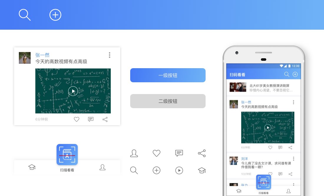
Semi-business: I used a light blue gradient to neutralize the business feeling. The smaller bottom navigation saved more room for the content, yet the scan button still popped out.
After finishing the first version of hi-fidelity mock-ups, we conducted a user test and iterated based on their feedback.
This feature allowed students to post text, pictures or videos. In 1.0, I used the fixed-size add button for different size screens. We received feedback that the button is too small on a bigger screen like the iPhone 8 Plus. Accordingly, I enlarged the “add” buttons to 25% of the total width to look consistent on all screens.
We clarified the edges in the “like”, “comment” and “forward” areas to reduce confusion.
As the most critical feature in WeScan, the scanning feature was given a lot of thought and love. The biggest challenge was merging two scanning features into one screen without confusing users.
My solution was to use scanning frames with different ratios. For textbooks, I used a 3:4 frame, which is the shape of most books. For QR codes, I used a 1:1 frame to remind users that they were supposed to scan QR codes.
News was another important feature in WeScan. At first, I didn’t really take the length of new titles into consideration and thought a subtitle or a short brief could help users browse the news more efficiently. During the user testing, we realized that It didn't work with longer titles since only nine characters could fit into one line. Therefore, we decided to remove the subtitle and give each news title two lines. With 14 or 16 sp/pt text, even the smallest iPhone SE screen could take at least 20 Chinese characters, which was enough for most news titles.
This project was the first time I worked with five different screen sizes (Android, iPhone SE, iPhone 8, iPhone 8 Plus , and iPhone X). In my previous projects, I usually only needed to deal with 1-2 screen sizes. It wasn’t until project WeScan that I realized being a pixel pusher all the time might not be a good thing, especially when you need to deal with more than 300 screens with different states. It is just as essential to make sure everything is good enough with the time given.
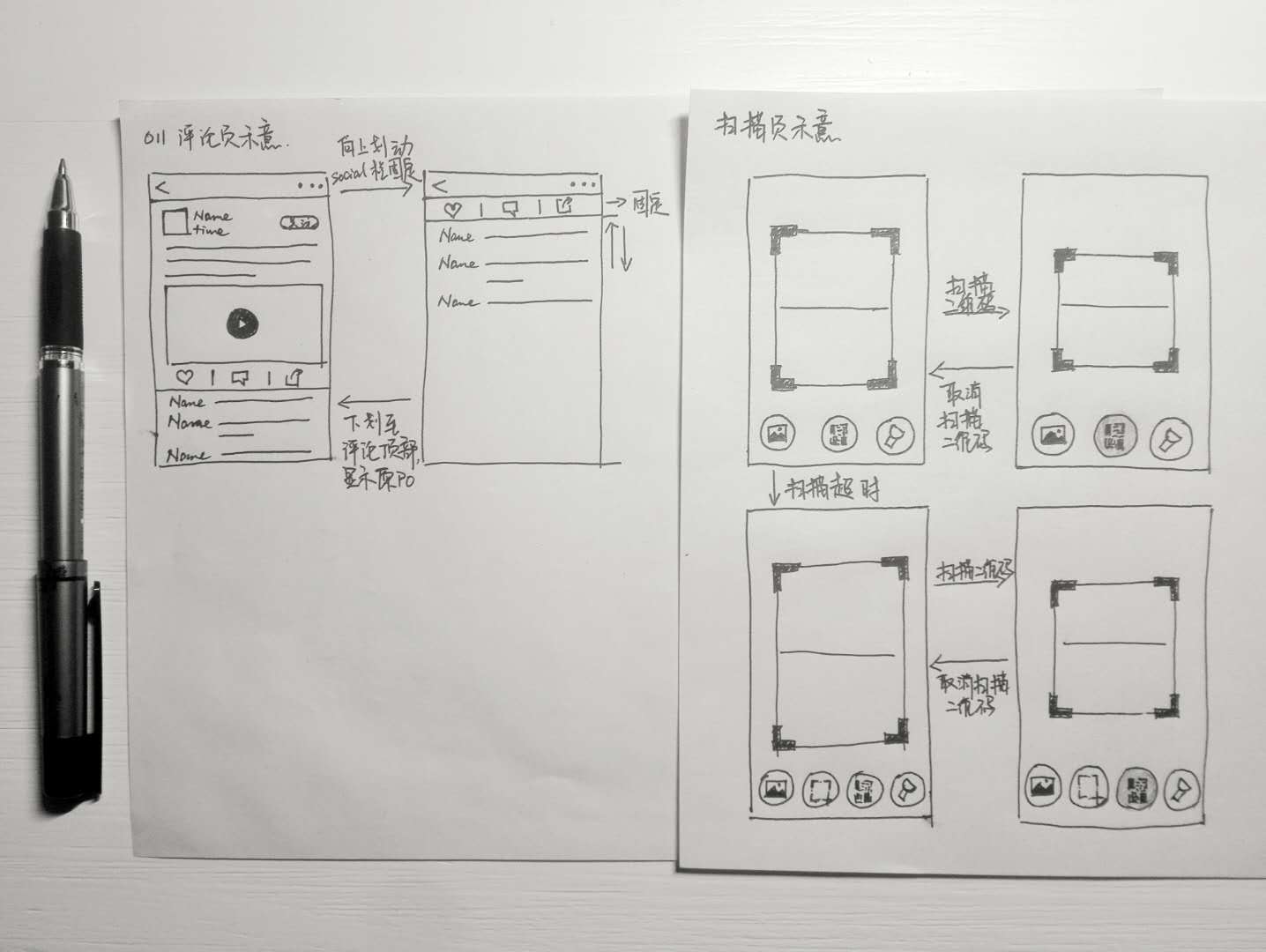
WeScan was a remote project. The development team was based in Beijing while I worked from my home in Inner Mongolia. The lack of in-person communication caused some problems at first. We both thought that our communications were being interpreted by the other party as intended when they were not. I soon found sketching to be a much faster and more powerful tool for communicating ideas, especially when working remotely.

I used sketches to communicate my ideas quickly.