Trip planning should be as enjoyable as the trip itself, no matter if it’s 2 hours or 2 weeks. Tripidee is a travel planner that helps people visually plan their itineraries.
A DESIGNATION UX team set the groundwork for this project. From them we learned that Tripidee served two very different types of users: meticulous planners and casual travelers. Meticulous trip planners need a way to collect and organize their travel ideas from various sources because they don’t want to miss out on the full experience. At the same time, casual travelers need a place to quickly pin the ideas they see because they don’t want to spend too much time on planning. Although their trip planning habits varies, they have something in common: they both like to plan trips visually.
“We want people to dream about trips with us, even when they’re not planning one.”
–– Yacine, CTO of Tripidee
Compared to that dream-creating vision, Tripidee’s existing website was more on the practical side. The homepage was more about tutorials than trip plans. Our client also wanted to change the dark photo treatment and blocky layout.
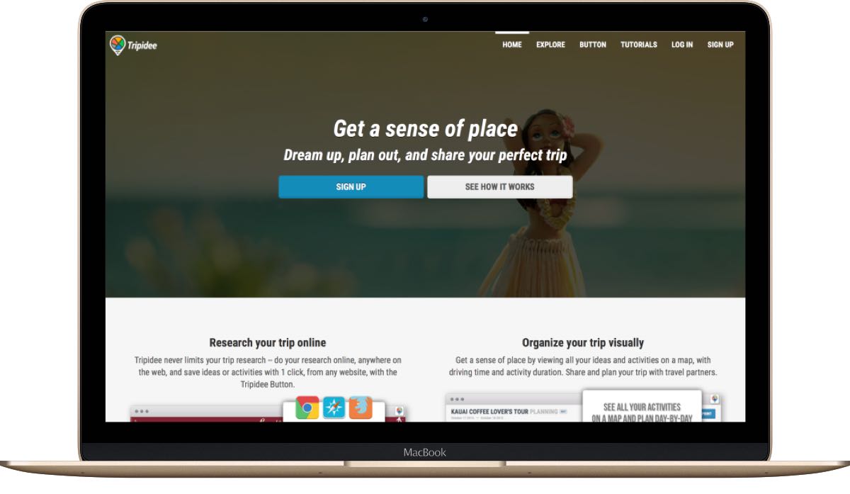
Tripidee's old website didn't align with their brand goal.
Our client wanted a fun and exploring visual style to make trip planning more enjoyable and organized, satisfying both meticulous planners and casual travelers. Our biggest challenge was:
How do we balance the needs of two seemingly opposite users through visual approaches?
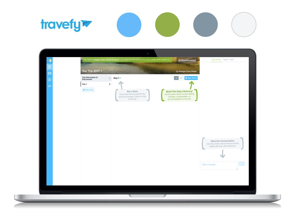
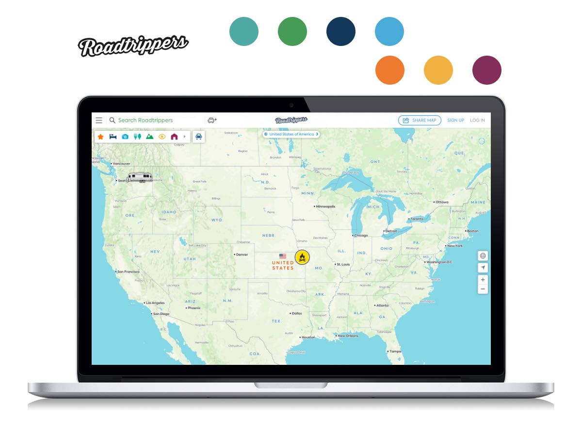
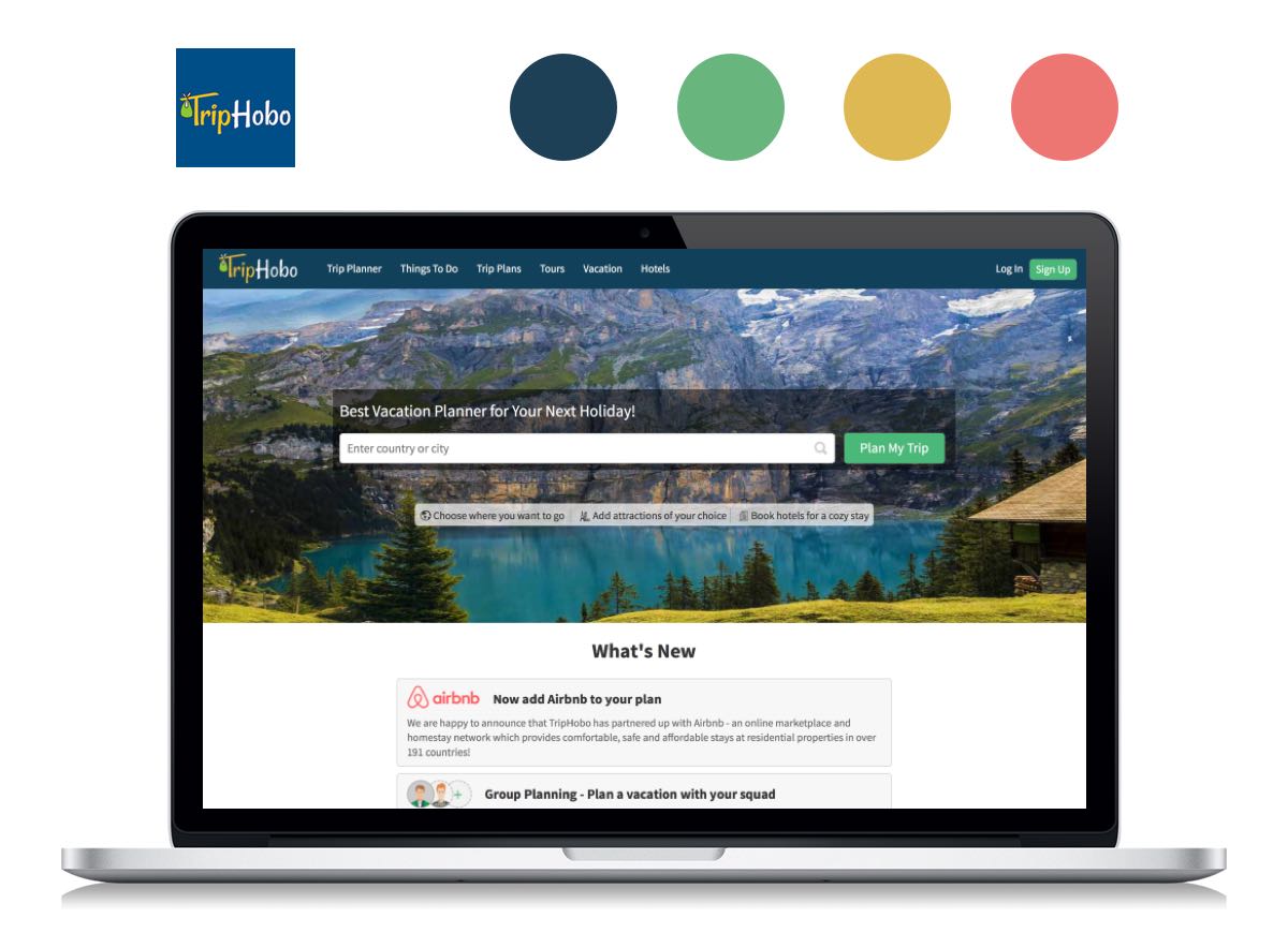
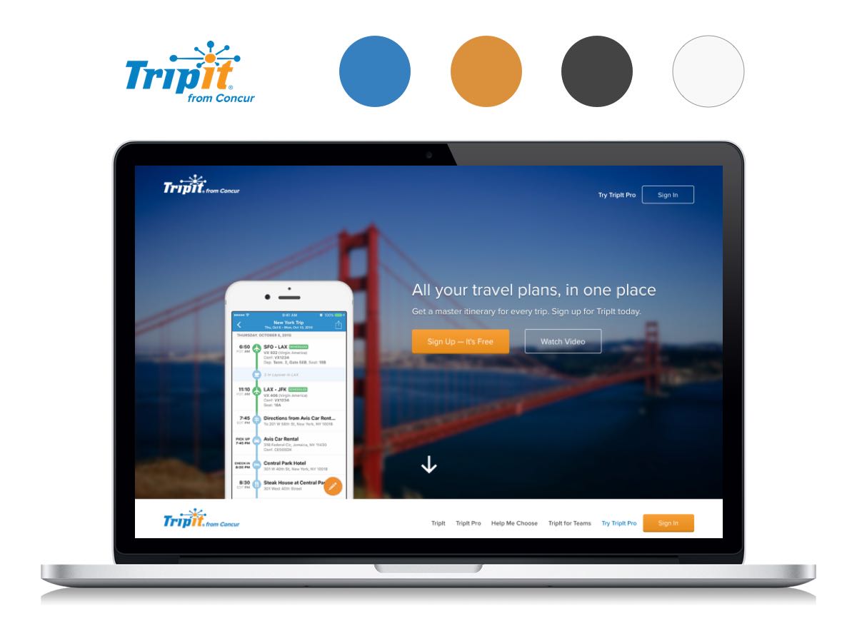
Keeping client’s need and vision in mind, we looked at competitors including Travefy, Roadtrippers, Triphobo and Tripit. Some of them are more professional and business like while others are more fun and playful. Some features photographies while others use more illustrations. We wanted Tripidee to be on the fun side and photography focused because travelers obtain much more information from photographs than texts or illustrations.
Besides competitors, we also looked at other websites for more inspirations. Instagram gave us a good example of clean card pattern. Airbnb balanced a bright and playful color palette with a clean interface really well. Pinterest inspired us on flexible photo organization.
With the research and client’s brand goal in mind, we came up with these principles to guide our research and design directions:
We want you to enjoy planning as much as traveling. Clean interface makes planning just as enjoyable as the trip.

You should enjoy travel planning, no matter if it’s only one page of a whole book. Our goal is to keep a balance between fun and sophistication.

Your travel plan starts the moment you see a breathtaking picture. We use photography to tell stories and to avoid information overload.

Your travel plan is not just about the destination, it’s about you. We use divergent photography to create memorable travel experience for you.
Based in Hawaii, Tripidee was highly inspired by tropical vibe but was quite open to different styles, as long as they carried the fun and exploring brand identity. With that in mind and guided by our design principles, I explored 3 divergent style directions.
Safari approach: This style used the same color palette as Tripidee’s current logo to keep a consistent branding. Icon buttons showed up when hovering the cards. Our client liked the color palette but thought the icon buttons with no labels might confuse users. Similarly, D1 for day 1 wasn’t clear and might be ignored by users. They appreciated the clean look and readability of the borderless cards.
Minimal approach: The thin line UI elements and neutral color made this style minimal and modern. Our client thought this style was too muted and Tripidee needed more excitement. However, they loved how I incorporated the picture in the pop-up background and thought it carried the exploring gene in Tripidee.
Tropical approach: Inspired by flamingo, this exciting style used bright teal and pink to reflect tropical vibe, but only in small portion so the interface stayed clean and organized. Our client thought the color palette aligned with their brand goal the most. They suggested using another font since Lobster was overused. They liked the white button but thought the gradient text should be more suttle and less feminine.
Based on the client’s feedback, I chose the tropical approach to start with and incorporated card pattern from the safari approach and pop-up window pattern from the minimal approach.
We worked on the wireframes created by a DESIGNATION UX team in the previous project with Tripidee. We analyzed the wireframes with them and found some things that could be improved:
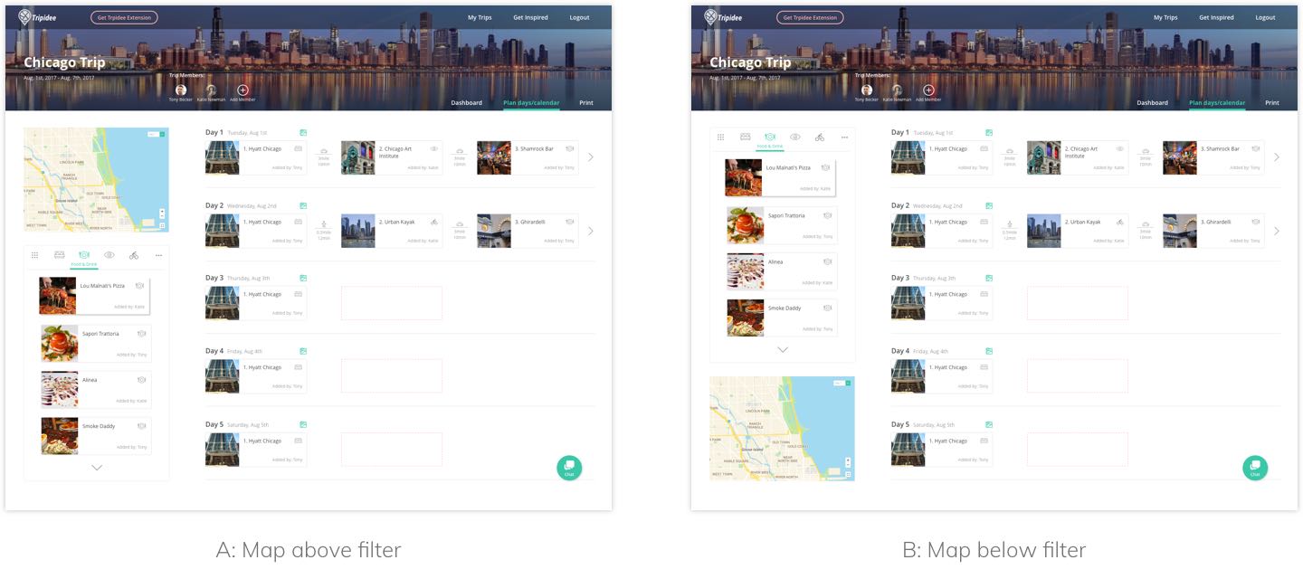
Some of these design decisions tested well in our two rounds of user tests. Users thought the icons with labels were much easier to understand but they wanted to see other labels besides the one they hovered over. They appreciated the clean and organized look of the calendar page. They understood the drag and drop feature even without the text. As for the A/B test, most users preferred the map on top since it was a more common practice.
I also received some feedback from both users and clients. For example, some users thought the “how it works” section on homepage looked a little dull. The “plan days/calendar” tab in sub navigation was not consistent with other tabs and “print” tab should be a CTA instead. After collecting and synthesizing all the feedback, I iterated several times.
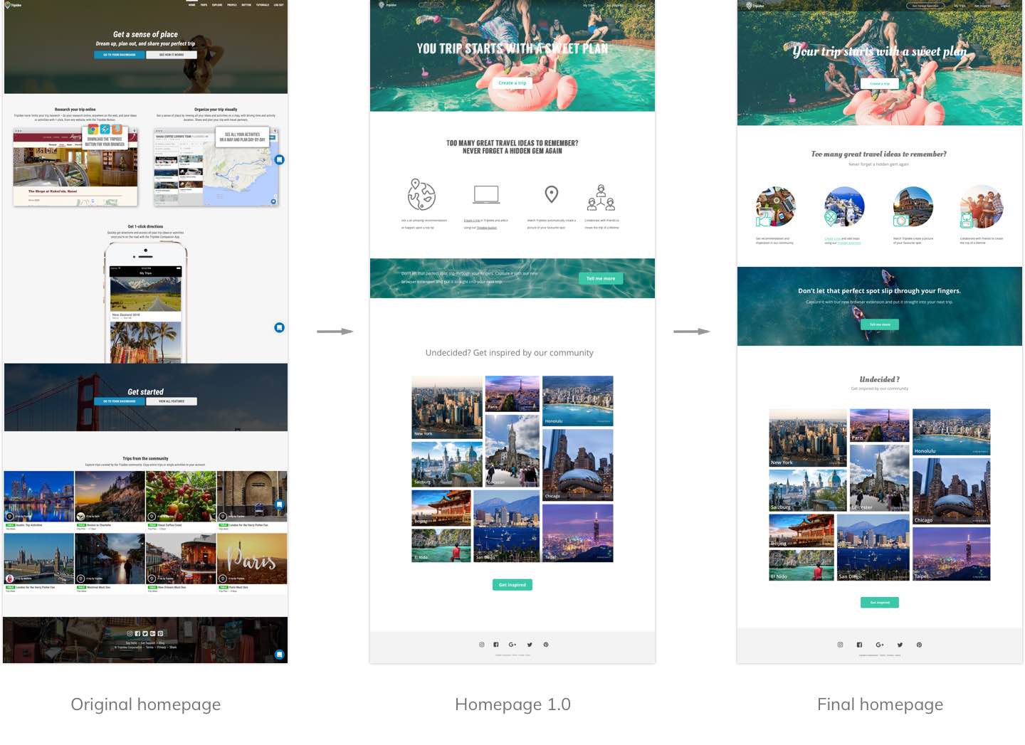
I combined icons with pictures to make “how it works” part more visually appealing. I adjusted the text hierarchy so it guided users better. I also darkened the navigation so it didn’t blend into the hero image.
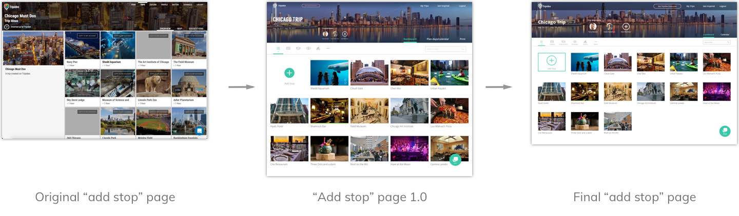
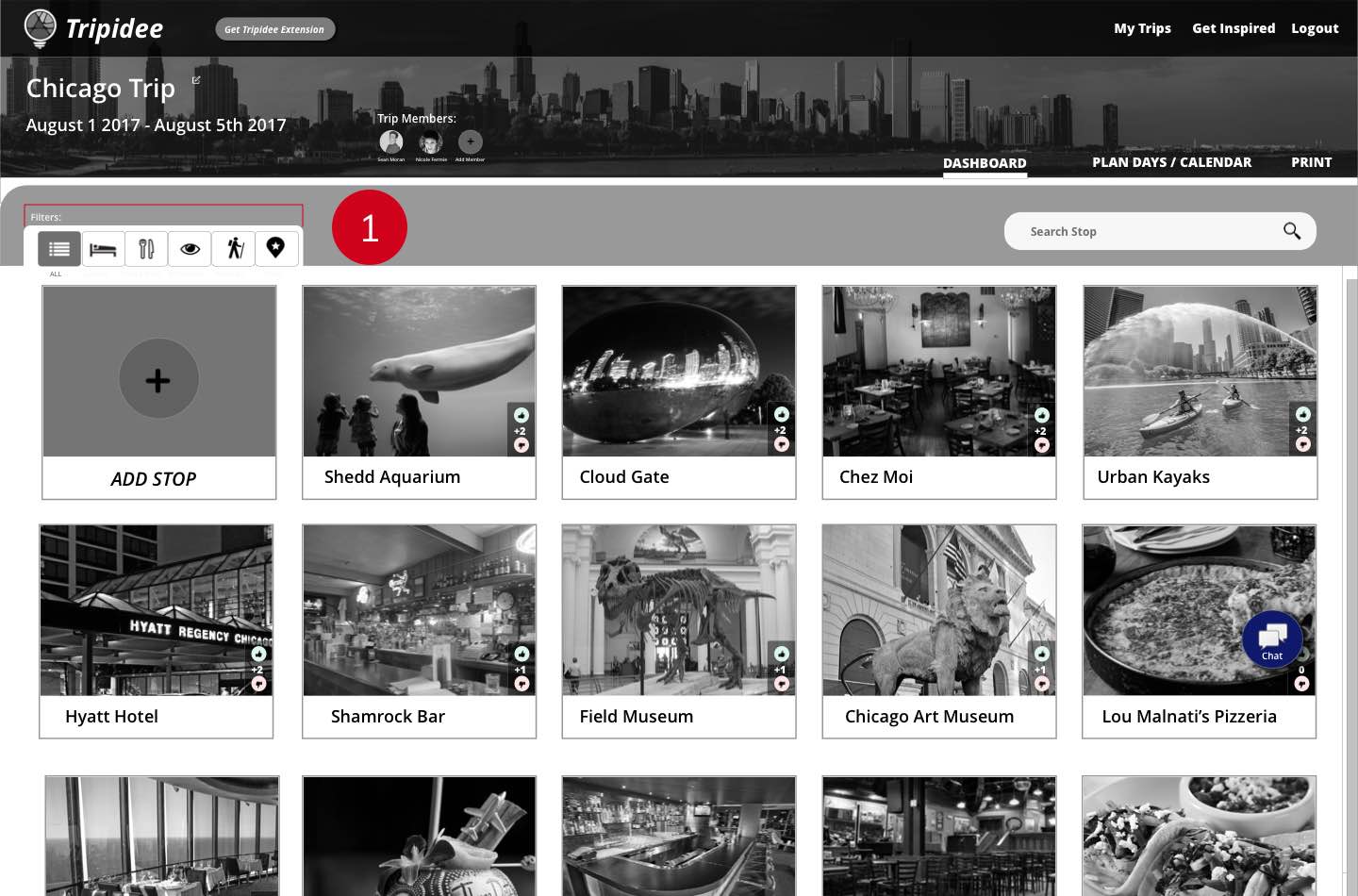
I rearranged the layout so it showed enough information in a relatively breathable way. I added text labels to all the filter icons to make them clearer. I enlarged the “trip members” icons because collaboration is an important feature for Tripidee. The “print” tab should be a CTA so I removed it from the sub-navigation.
After two rounds of testing and several rounds of iterations, I arrived at my final screens.

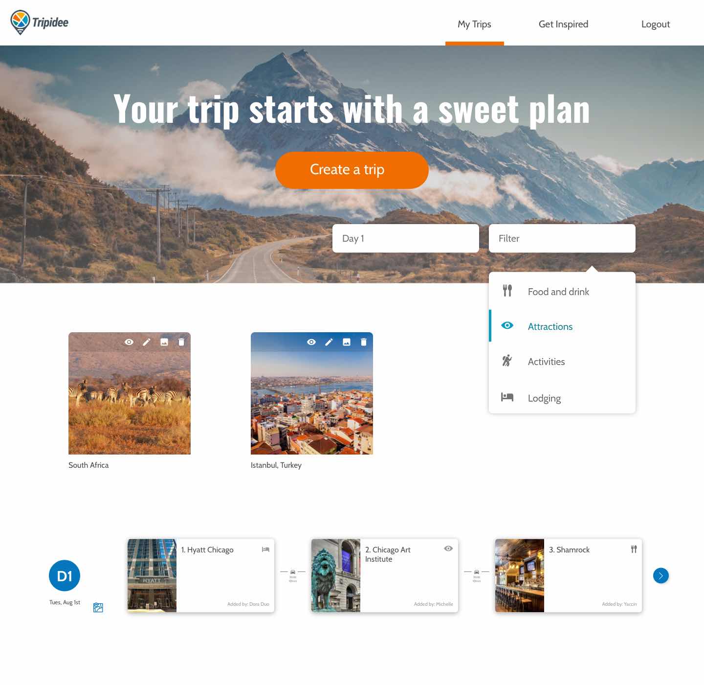
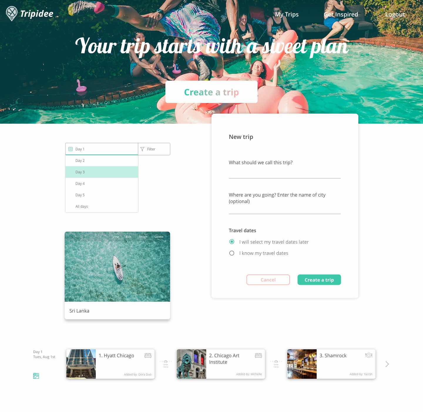
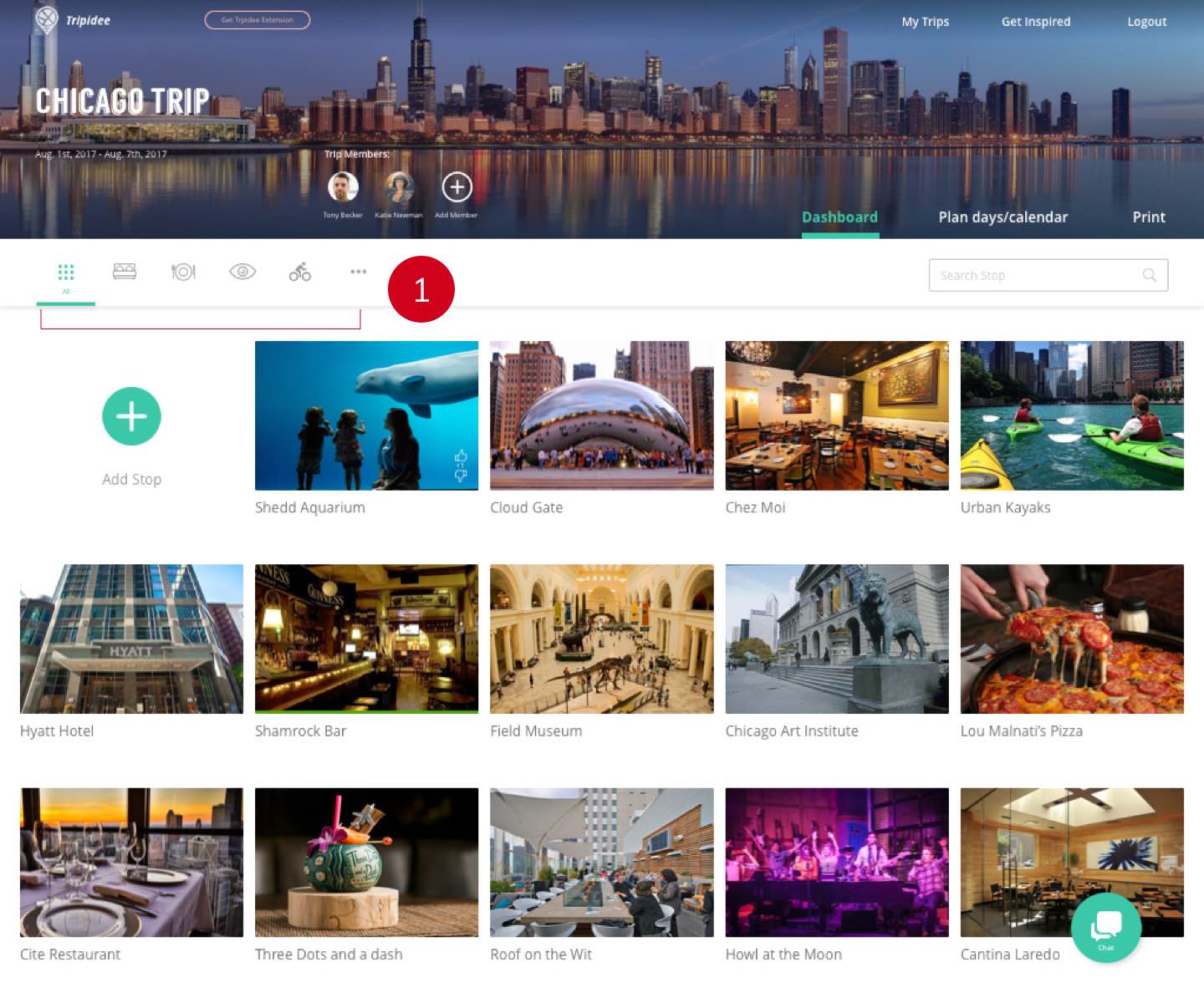
The home page conveys the playful and adventurous feeling through dynamic photography, casual typography and iconology.
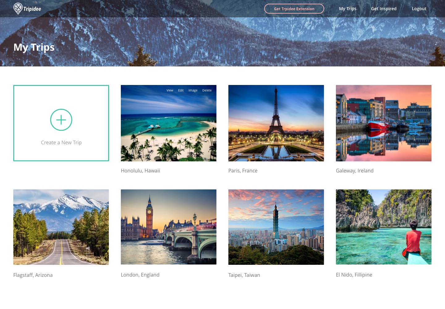
The organized layout is clean and self-explanatory. Separating pictures and trip titles makes it digestible. Text buttons show up when hovered, not intruding the pictures.
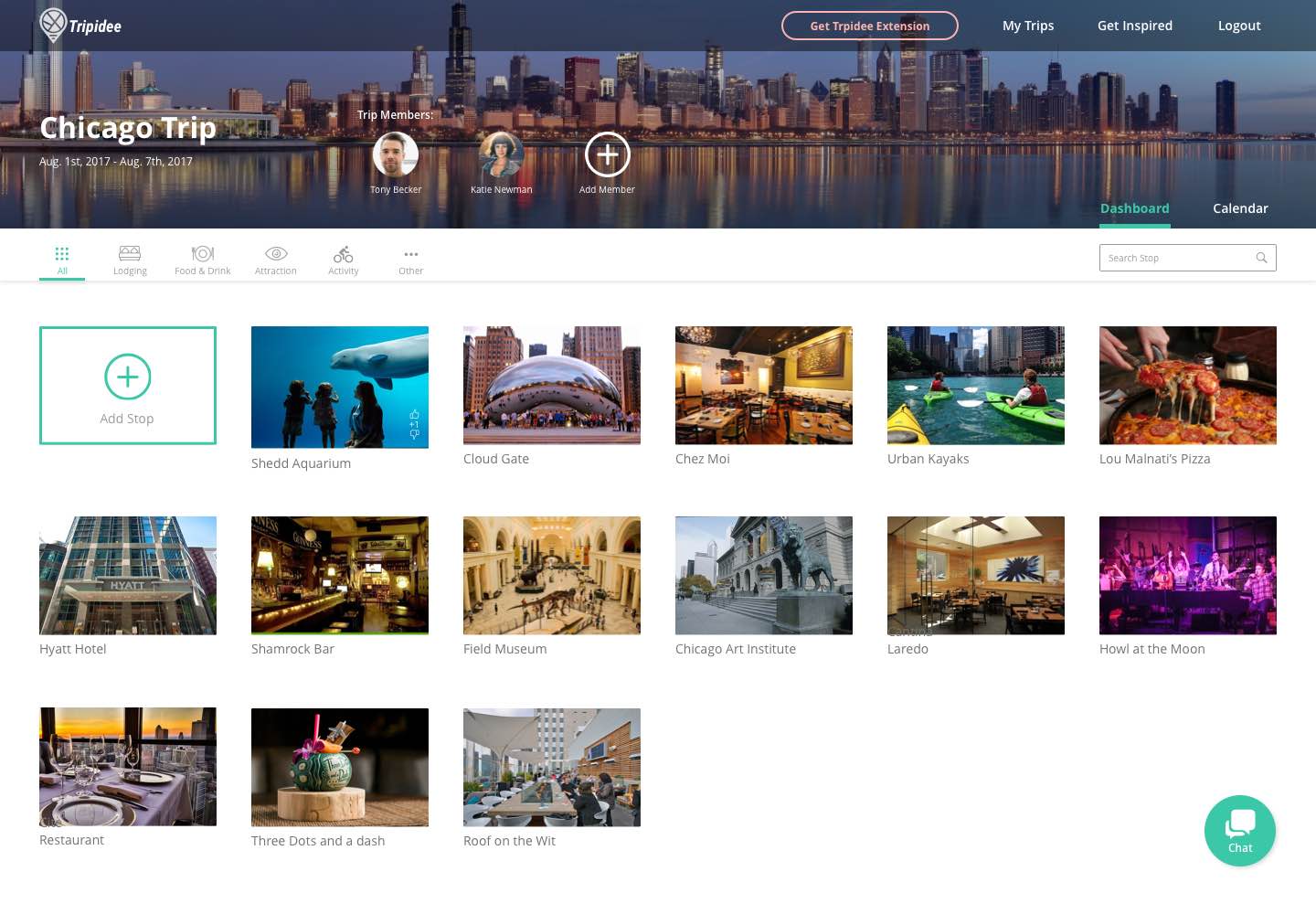
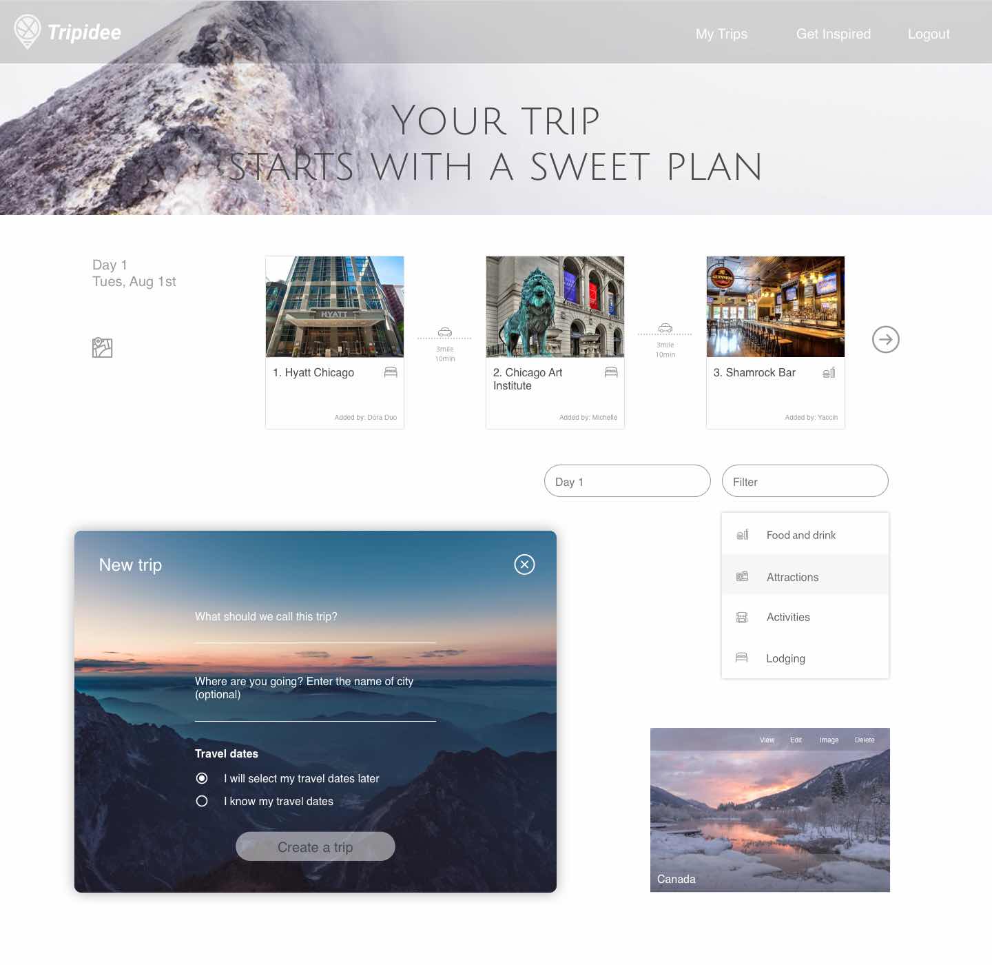
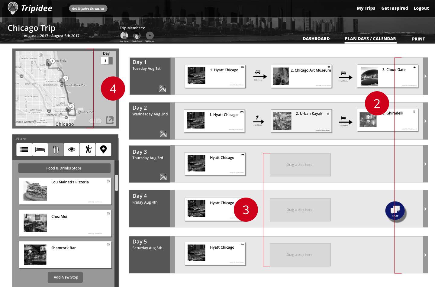
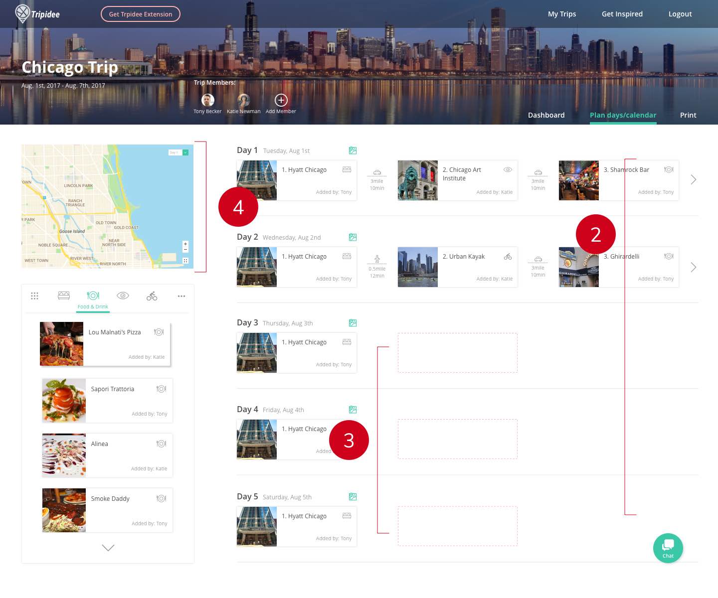
This page shows many stops in a relatively breathable way. The top section shows the basic information about the trip.
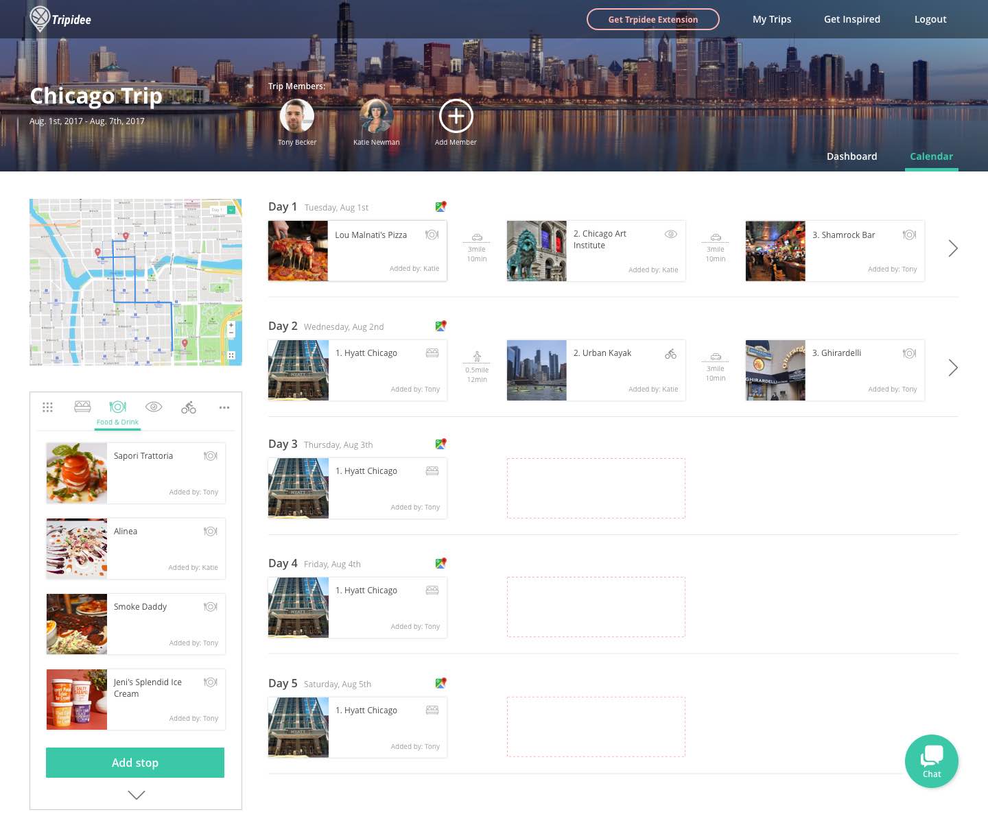
The drag and drop feature is self-explanatory. Filter and transportation icons help users understand the plan quickly.
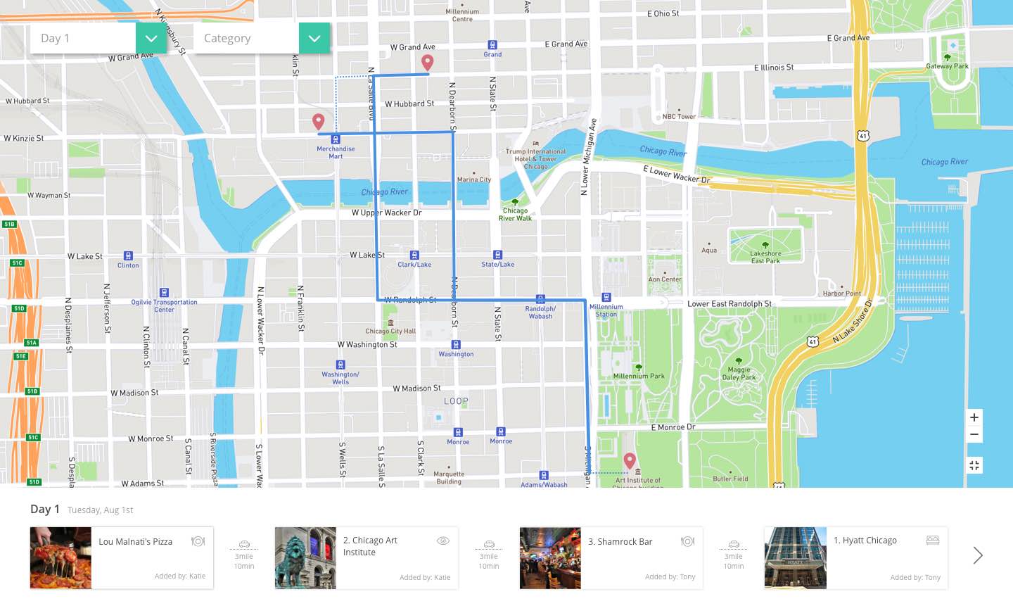
The full screen map has additional filters for users to view stops by day and by category.
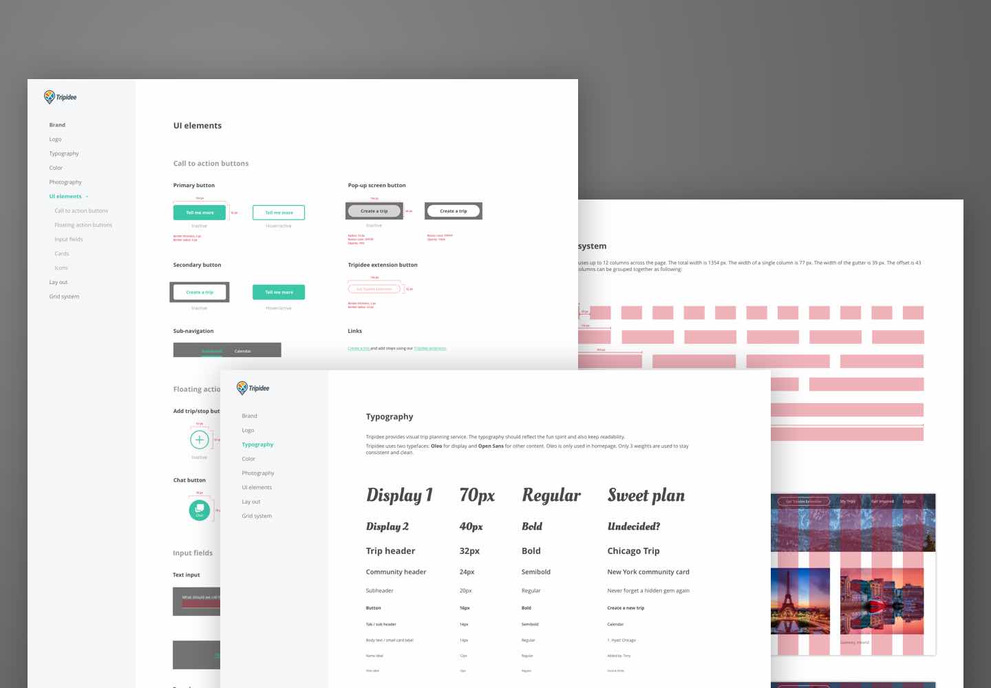
Not only did we accomplish a lot of work in 3 weeks, we also built an incredible relationship with our clients. They appreciated how my tropical and exploring style aligning with their brand. They thought the icons for transportation were quite helpful and appealing. We even received an amazing Hawaiian snack box as a thank you after the project. To help further developing Tripidee’s brand, I also created a style guide.
Before DESIGNATION, I worked for QYER, a travel website and trip planning tool in Beijing. I really enjoyed how Tripidee gave me a chance to bring my previous experience into this project. If given more time, here’re some things I still want to work on:
In our test, users couldn’t easily find the filters on map because they were more used to standard maps. Since it’s an important feature for Tripidee, I want to try some better solutions. One idea is to add a feature introduction for first time users.
We decided not to include the add stop flow in the final product because it was overly complicated for users and needed more UX work. We didn’t have enough time to do that in 3 weeks, but I want to keep working on simplify the process to improve the trip planning experience for users.
Tripidee was my first real client project. Thought the process, I learned the value and beauty of user testing, especially for UI designers. User test is such a powerful tool to drag us out when we fall into the rabbit hole of personal aesthetic. I learned in practice that every design decision should be backed up by research.
The experience of working with a real client taught me how to be empathetic, not only for users, but also for clients. Putting myself in the client’s shoes really helped me understand their needs and goals.