Client: Dealer Fox
Timeline: 3 weeks
Role: UI designer
Challenge
Car shopping shouldn’t be an experience of drowning in overloaded information. People need less noise and more confidence when searching for their dream cars. Dealer Fox is an automotive search platform that connects dealerships and car buyers, increasing buyers’ trust and confidence and saving them time and effort by providing a better car search experience.
Dealer Fox thinks people should feel comfortable when approaching the car buying space. To align with that, the online platform should be approachable by not dedicating itselfto a certain brand or luxury style.
Our client wanted a clean, modern and organized visual style to make users feel more in charge. They wanted to differentiate the website from typical, cluttered dealership websites that people dislike but are used to. Considering Dealer Fox’s wide user age range from 25 to 55, our biggest challenge was:
How can we introduce a cleaner and simpler car buying experience and visual style to users without making them feel unfamiliar?
Understanding the brand and domain
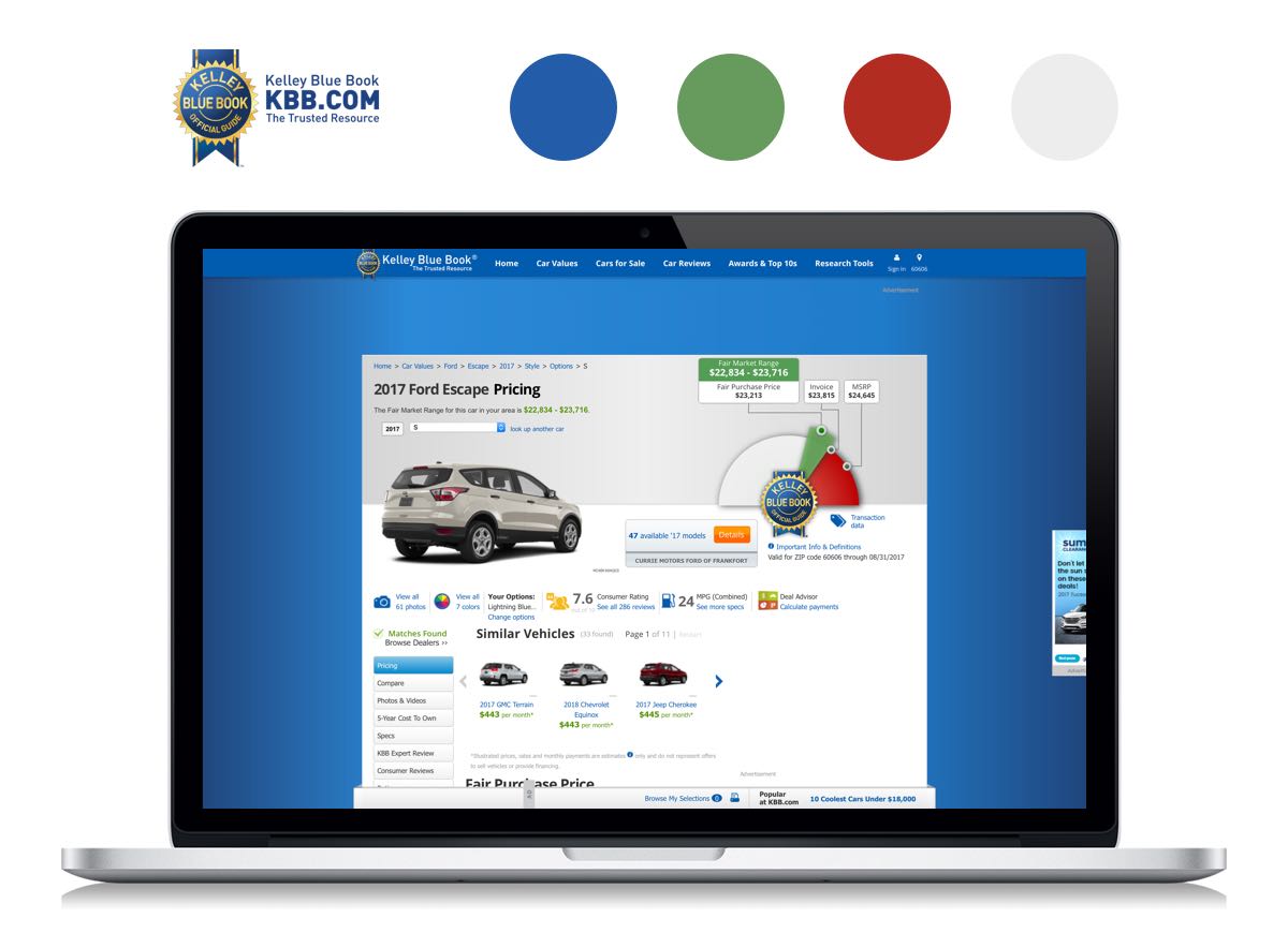
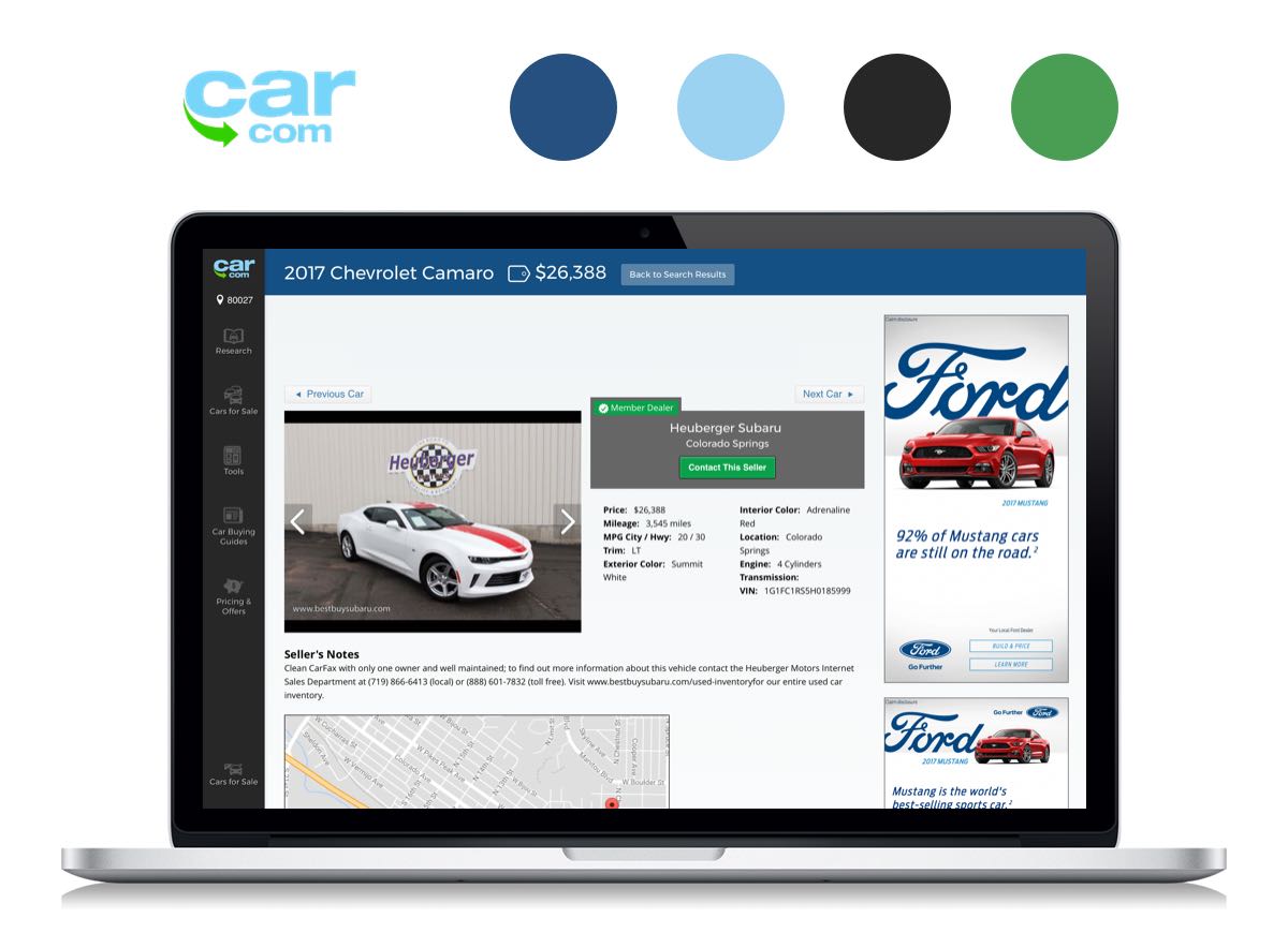
With our client’s vision and needs in mind, we looked at competitors including Kellybluebook, CarMax, Car.com and CarGurus. Most of these websites share a typical dealership website aesthetic: busy and cluttered layout, hard-selling visual cues and big annoying ads.
Knowing what to avoid, we looked for more inspiration. Airbnb, Padmapper and Warby Parker gave us ideas on how to balance clean design with the need to visualize large amounts of information.
We realized Dealer Fox needed these things to differentiate itself from its competitors:
- Clean and uncluttered look
- Clear CTAs and visual guidance
- Apparent price information, but not the hard sell
With the research and client’s brand goal in mind, we came up with these principles to guide our research and design directions:

Green means go
Car research is already complicated enough. The experience Dealer Fox offers should be simple and self-explanatory so that both customers and car dealers can use it without extra learning.

Your ride, your way
Everyone should feel comfortable visiting Dealer Fox, no matter what price range they are looking for. The general look and feel should be applicable to different kinds of cars.

Know the route
Car buyers should feel confident and knowledgeable in their purchase. Dealer Fox uses informative visual elements to help users understand better, building confidence and trust.
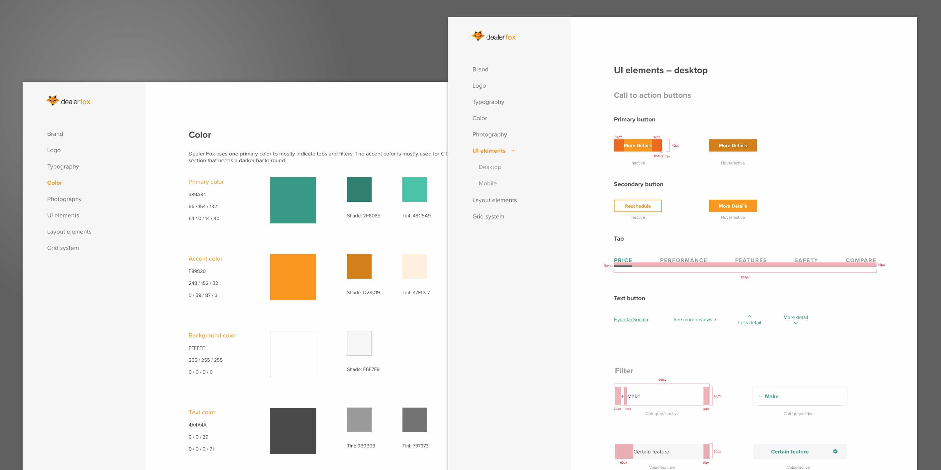
Style exploration
Guided by research and our design principles, I explored 3 style directions. Each direction kept the logo and orange color from clients’ current brand , yet were divergent.
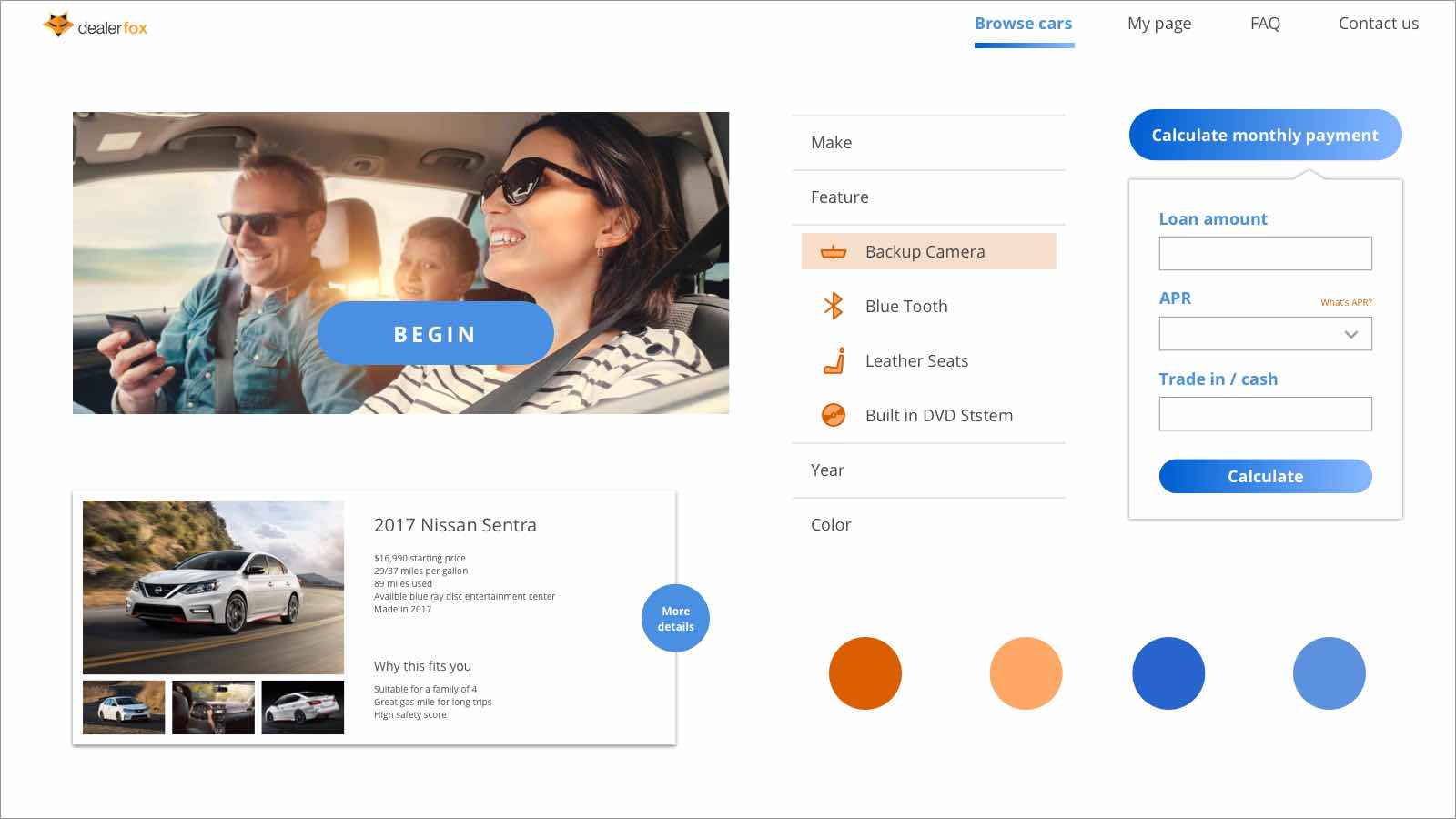
Family approach: This bright style used a blue gradient to balance the orange theme. Icons and round CTAs added some playfulness. Our client thought the pill-shaped CTAs and blue might be too trendy for older users. He liked the idea of using icons in the filter but had some concern about how it would work with many more variables.
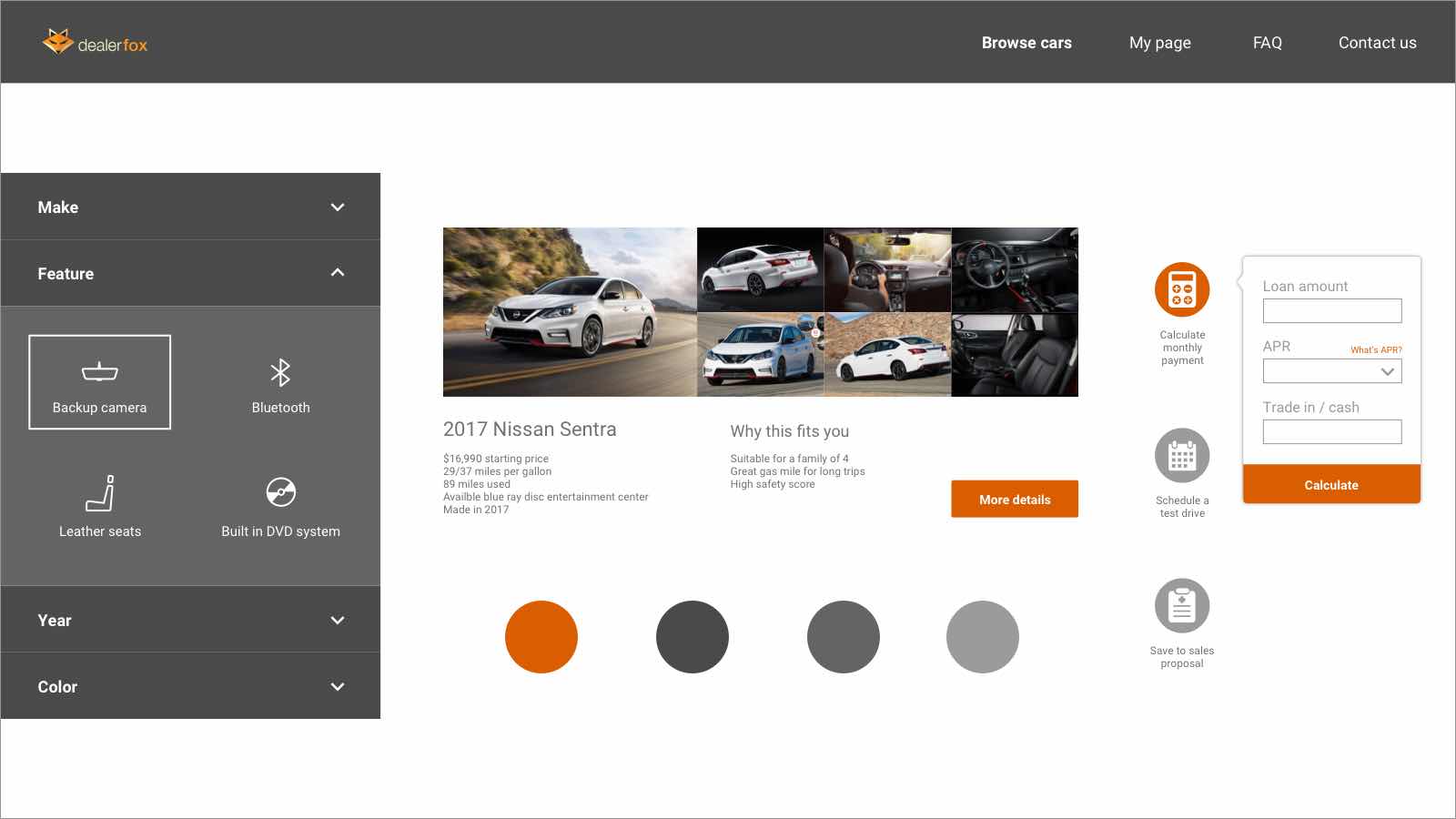
Professional approach: Inspired by mechanical systems, this approach used a darker color scheme paired with a warm accent color. Our client liked how tool buttons jump out right away. He thought the color palette might be too professional and mechanical, and the borderless card might confuse users.

Urban approach: The typeface and thin line contributed to the modern and sleek feeling. Our client liked how nicely this style incorporated the teal in their current orange color palette. He appreciated the cleanness of the filter but expressed the concern that the small font size might affect readability, especially the price since users always look for it first.
Our client thought the urban approach aligned their brand identity the most, but they also liked the tool buttons in professional approach and the white top navigation bar in family approach. Taking the feedback in mind, I combined elements from each style tile and applied the new style to the initial mockups.
Improving the experience
Before our project, Dealer Fox worked with a DESIGNATION UX team to research and create wireframes. After analyzing the wireframes with the UX team, we found some things that could be improved:
Wireframe problems
- The search filter caused some confusion during testing. Users didn’t know why they still needed to filter after taking the onboarding quiz.
- The car information needed to be better visualized.
- The UX team removed the contact dealer button and put it in car display page.
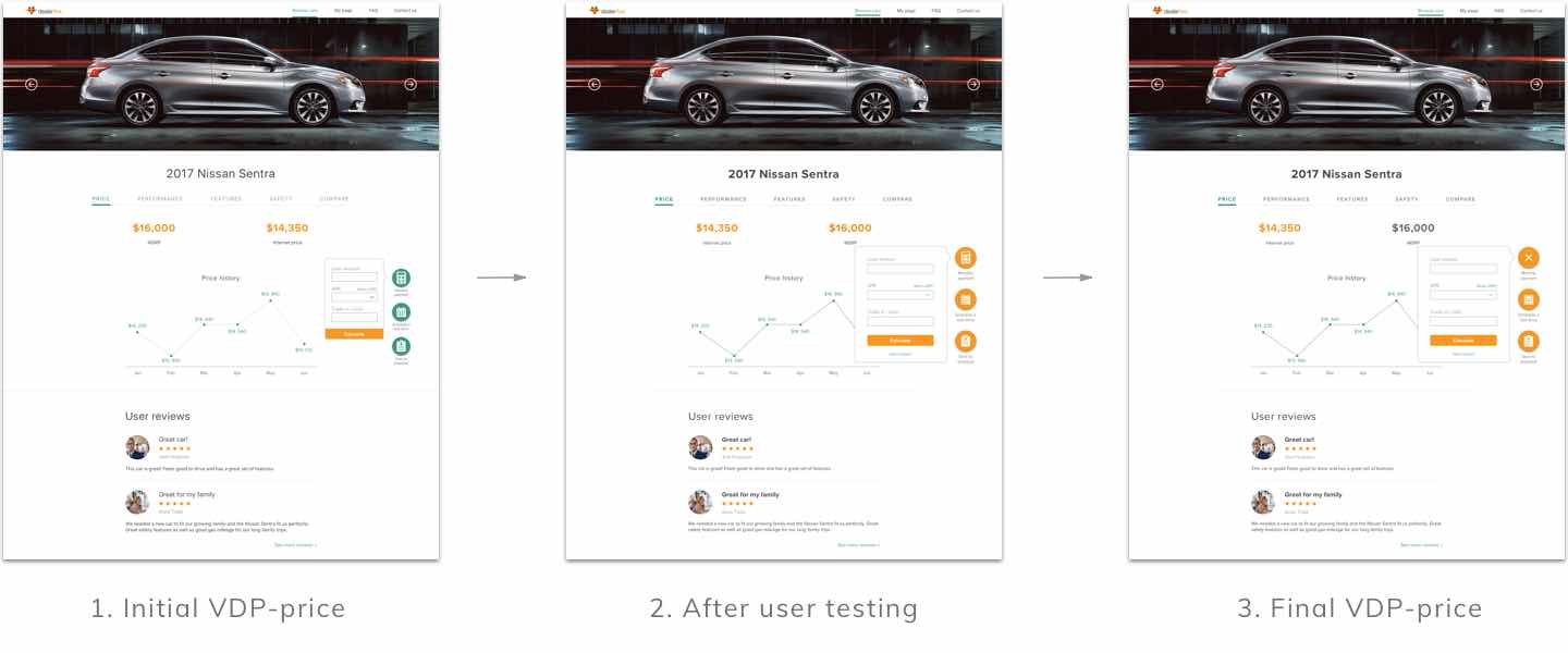
- The pricing information on VDP didn’t stand out the way they needed to.
- The tool buttons needed better visualization.
Wireframe solutions
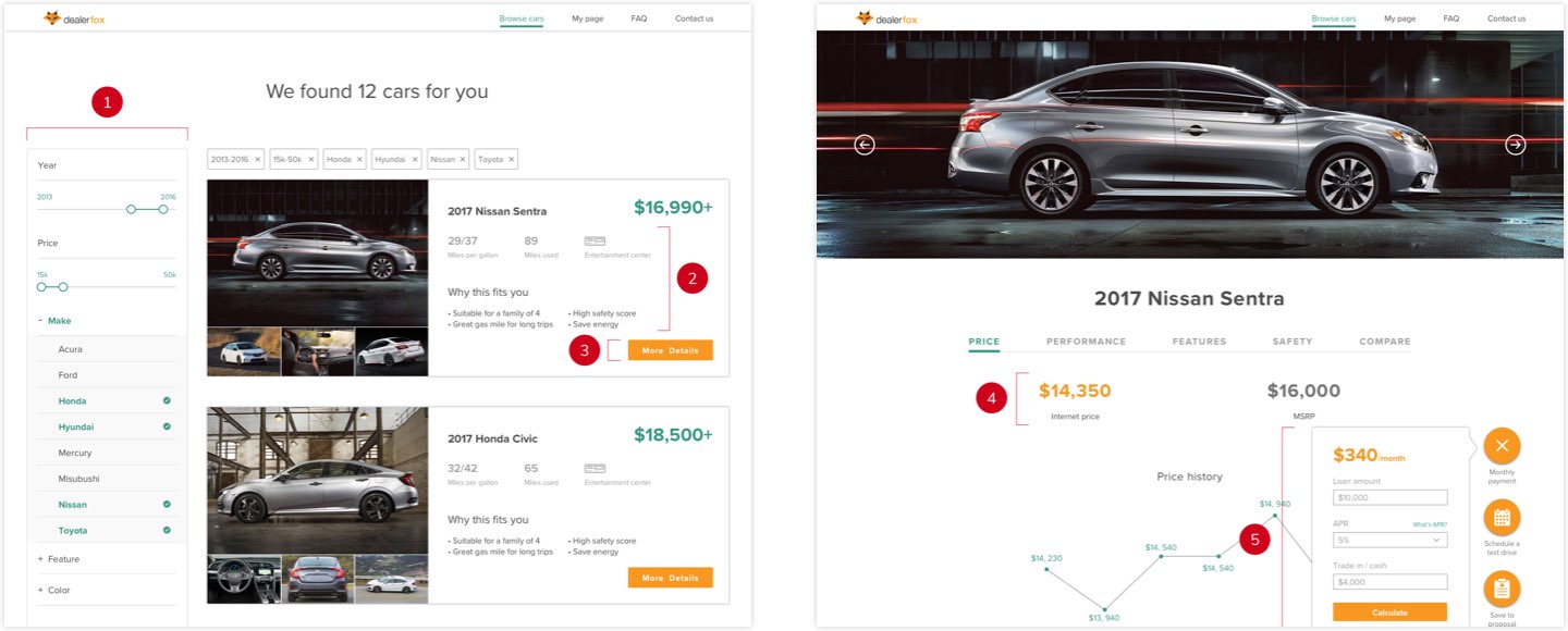
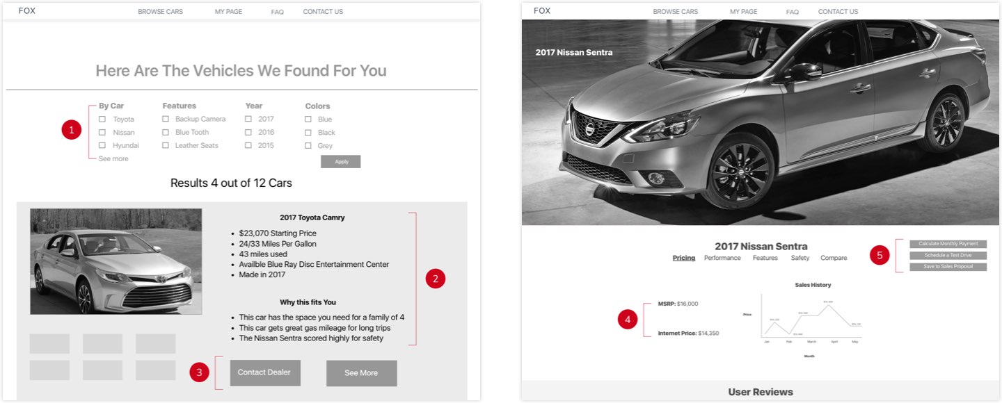
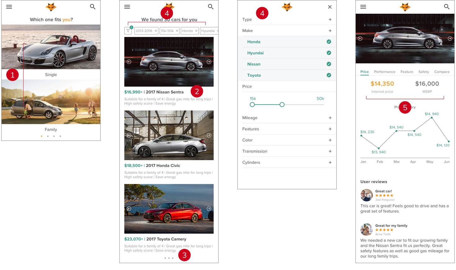
- I changed the top filter into a sidebar filter so it didn't block other content.
- I removed unnecessary information and reorganized the page to create better hierarchy.
- We removed the contact dealer button.
- I emphasized the price because research showed that users always tried to find price first.
- I redesigned tool buttons and made them sticky buttons to make them more obvious.
These design decisions were proven effective during our two rounds of testing with users who ranged in age from 24-58. Users responded really well to the side filter because it’s a familiar pattern and they knew how to use it without extra learning. The font size worked well, especially for older users. They liked the visualization and information hierarchy because it helped them find pricing information and to use the filter fast and easily during the test. These changes all contributed to the goal of introducing a cleaner and simpler dealership website without making users feel like it was an unfamiliar experience.
I also received feedback on information organization for the search result page and visual guidance for the vehicle display comparison page. I did several rounds of iteration based on the feedback.
To make this website responsive, I analyzed the mobile wireframes created by the UX team and made changes to make it more mobile-friendly.
Wireframe problems
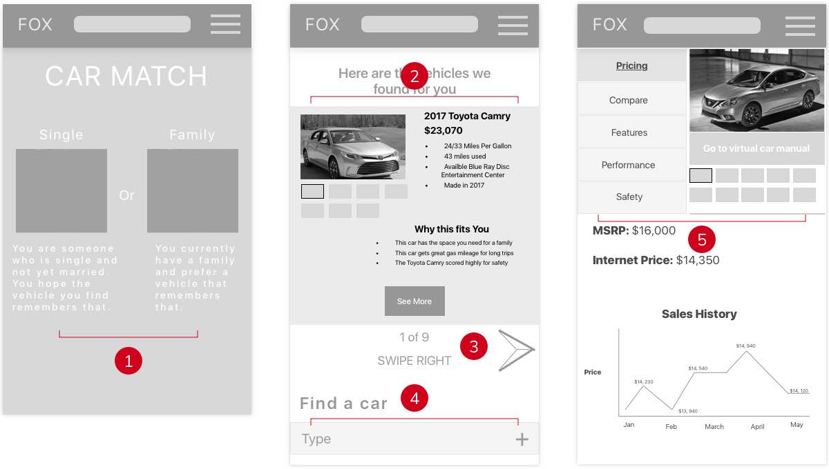
- The horizontal layout and unnecessary text didn't use the real estate effectively.
- The desktop card pattern looked cluttered on mobile devices.
- Users had to swipe to see more search results.
- Users had to scroll down to see filters. With the swiping feature, some users might forget to scroll down.
- The cluttered layout didn't create a nice hierarchy.
Wireframe solutions
- I used a vertical layout and removed supportive text since users could understand with just the titles.
- I simplified the card and only kept the most important feature to avoid information overload. I also removed the CTAs because users don't really need a button when they can click the card.
- I kept the scrolling feature like the desktop version so that users can view multiple search results.
- I relocated the filter to the top of the first screen with labels, so that it doesn't take too much space and users can find it anytime.
- I changed the layout to be more consistent with the desktop version and create better hierarchy.
Final product
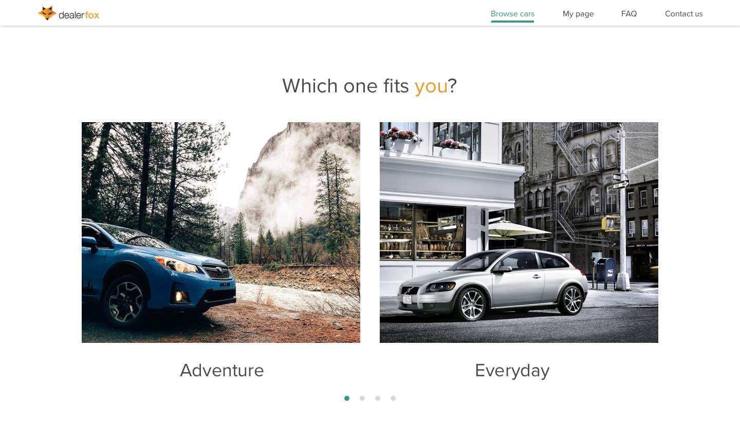
The wireframes we received were well structured. The whole flow was based on 4 key screens: homepage, onboard quiz page, search result page and vehicle display page. I built those high-fidelity screens with multiple states.
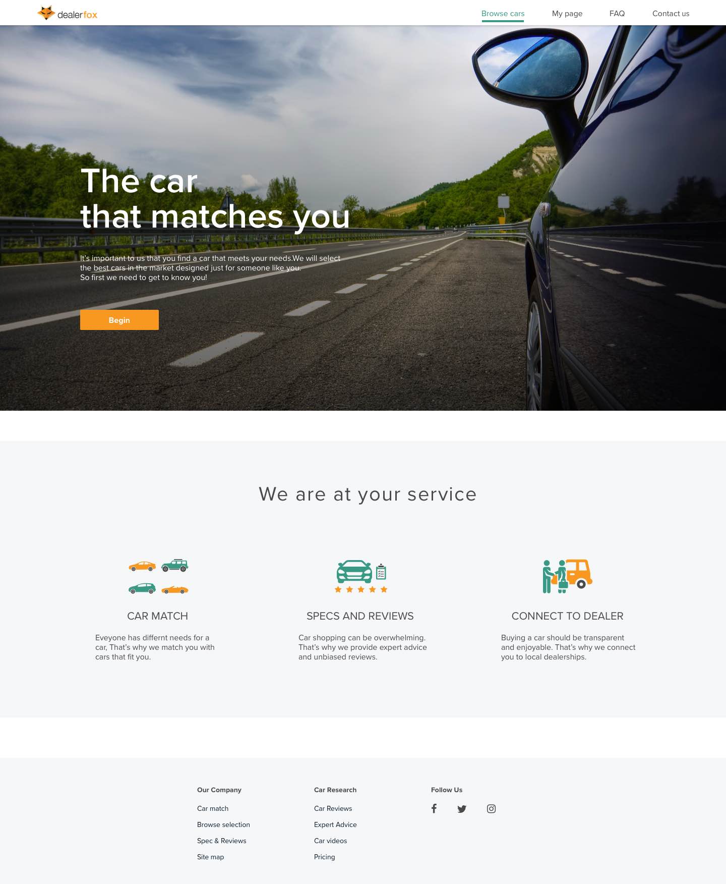
Edge-to-edge hero image and one clear CTA differentiate Dealer Fox’s home page from typical cluttered dealership sites. Icons illustrate Dealer Fox’s feature and strengths.
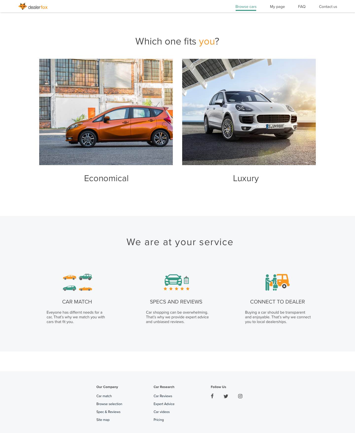
Users go through a few questions to narrow down the car choices that match them. The CTAs are loud and clear. The pagination gives users a sense of place.
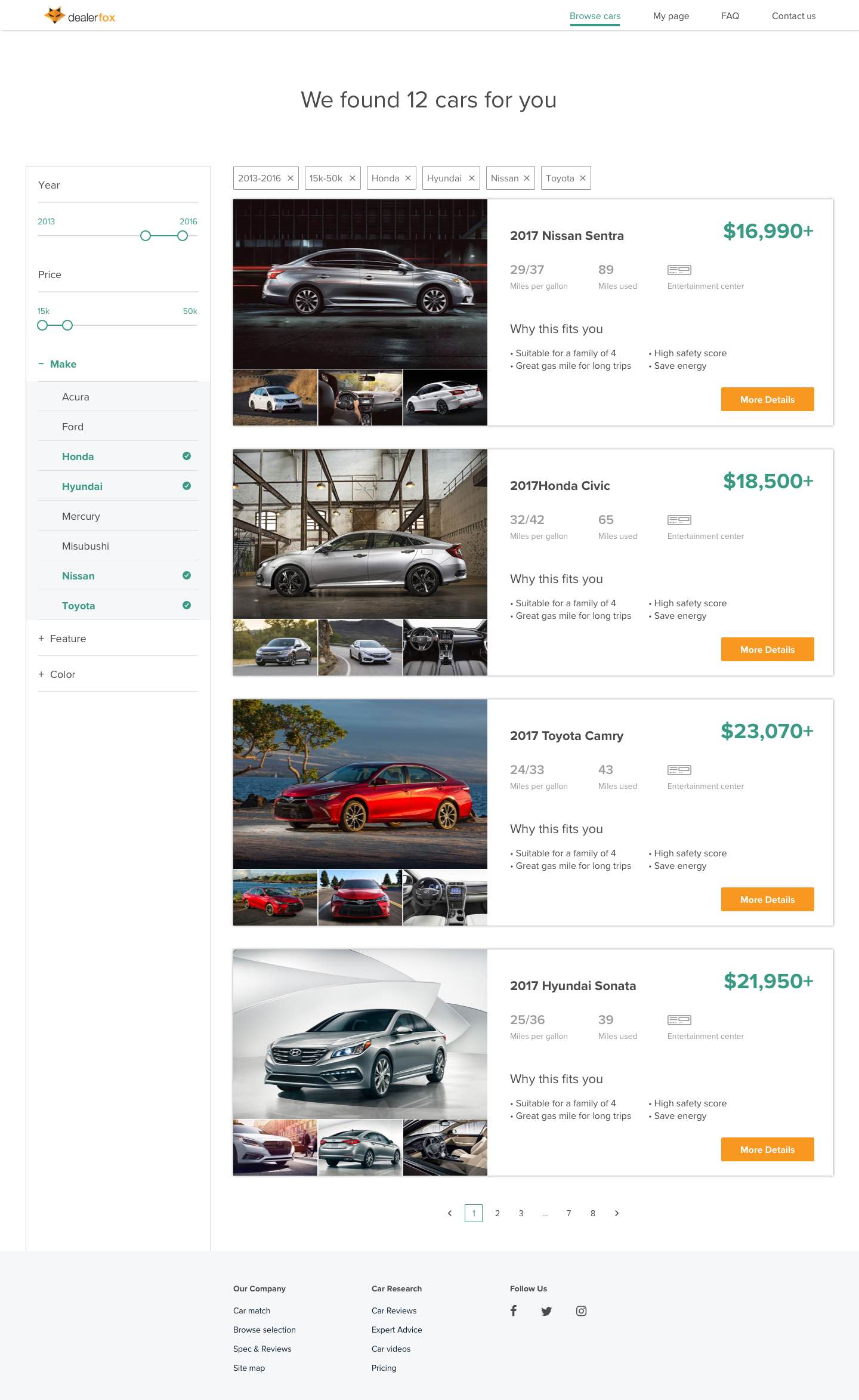
The sidebar filter allows users to select features without blocking the search result. Labels show users’ selections and allow them to do a quick edit.
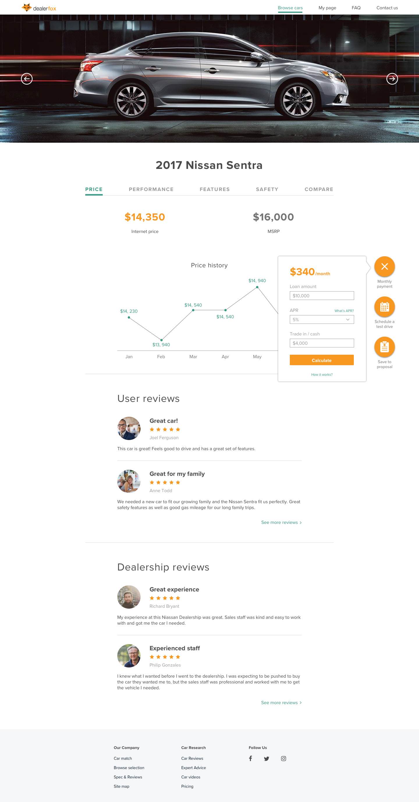
The visual hierarchy effectively guides users to the information they care about the most: the look and price. Icons help users understand mechanical features more easily. The tool buttons stand out but don’t compete with the main content.
Our client appreciated my style exploration and applauded the final modern structured aesthetic. They thought I did a good job synthesizing the testing feedback and iterating based on the insight I pulled from it. They implemented my landing pages and left-bar filter design on their new website. To help further developing Dealer Fox’s brand, I also created a style guide.
Final thoughts
I am proud of the work I’ve created for Dealer Fox. If given more time, here are some things I’d still want to work on:
1. Find a better solution for the onboard flow pagination
In our testing, users had different opinions about the pagination in the onboard flow. Some understood that it indicated how many questions there were, while others were confused and thought they could slide to view more pictures.
The UX team wanted the pagination to be a navigator for users to review and change their answers during the quiz. I want to try more solutions and do more testing on that.
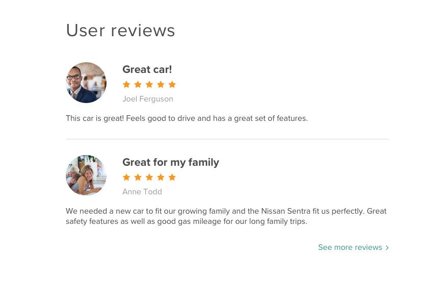
2. Create a profile icon set
Everyone loved seeing profile pictures but few wanted to upload their own. Our client suggested using different default icons for those who don’t want to upload their own pictures in order to keep the reviews section engaging and trustworthy. We didn’t have time to test the idea within the timeline but I would keep working on it since it’s a common problem for many companies.
3. Include the dealership information
We found the elephant in the room at last minute. It was only in our second-to-last user test that we realized the dealership information was missing. The UX team went back to iterate on the wireframes and it’ll be added in the future.
What I learned as a designer
By working with Dealer Fox, I learned how to explore within a client’s requirements and expectations. Dealer Fox already has an existing brand and wanted the new product to keep a similar color palette. I kept the orange and incorporated the teal, which received positive feedback from both the client and users.
I learned to conduct user tests more effectively and efficiently. I definitely made progress on framing questions and catching details in testing.
I learned how to work with ambiguity. Since Dealer Fox’s UX team was iterating on the wireframes during our UI design process, we had to work closely to make sure our goals were always aligned. This experience showed me the value of being agile and flexible, and always leaving room for future iteration.