NOTED was a mock project for DESIGNATION. We were tasked to design a digital product that helps parents participate effectively in their children’s academic lives in middle school and high school.
A DESIGNATION UX team set the groundwork for this project. They designed an app that helps students keep track of their school life and share thoughts with their parents. I teamed up with three UI designers to develop the branding and identity for the product. Over the four week-long sprints, we designed high fidelity mockups, prototypes, a responsive marketing website, a UI kit and a style guide.
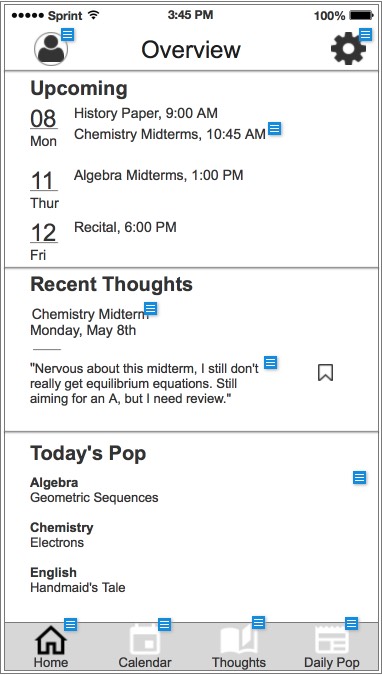
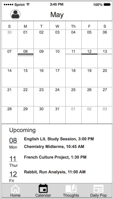
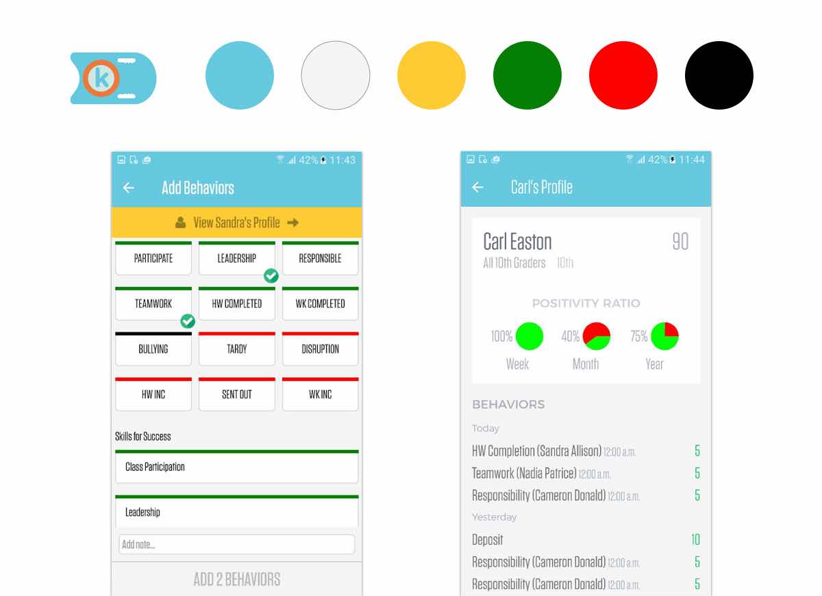
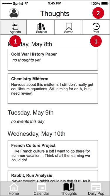
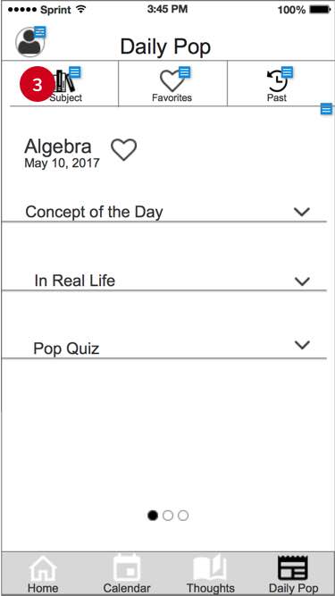
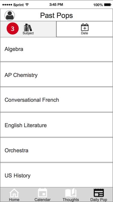
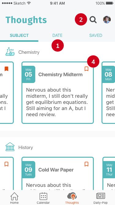
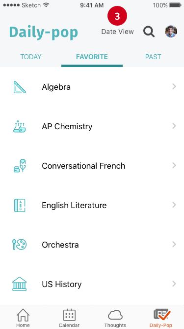
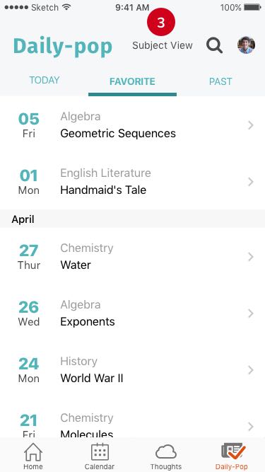
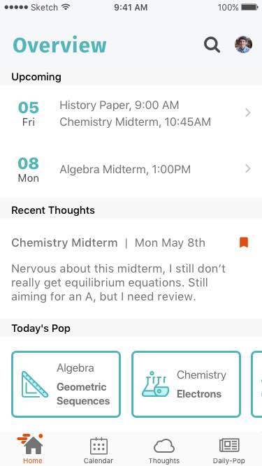
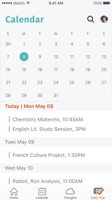
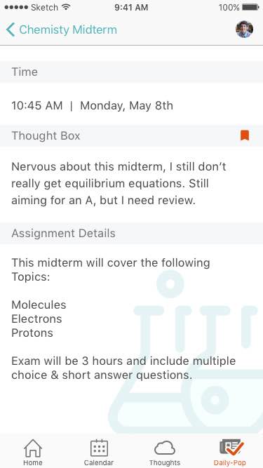
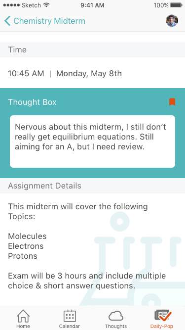
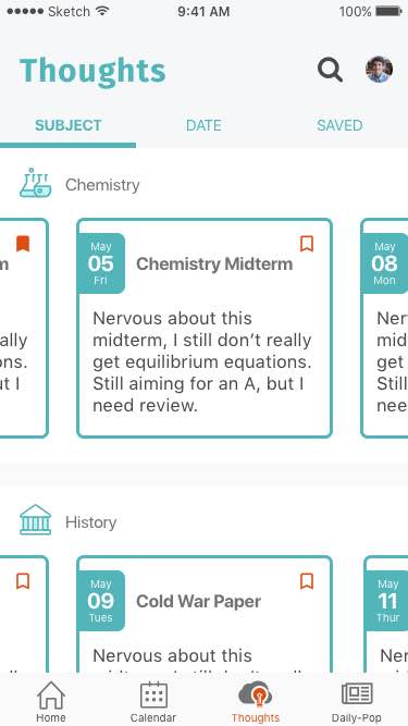
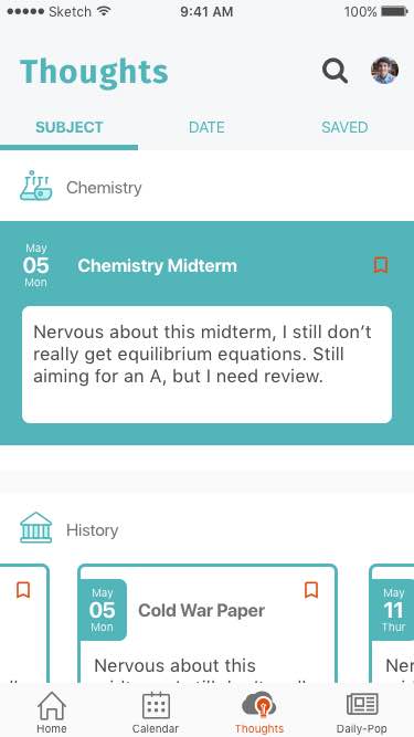
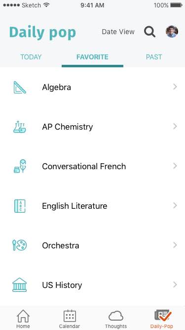
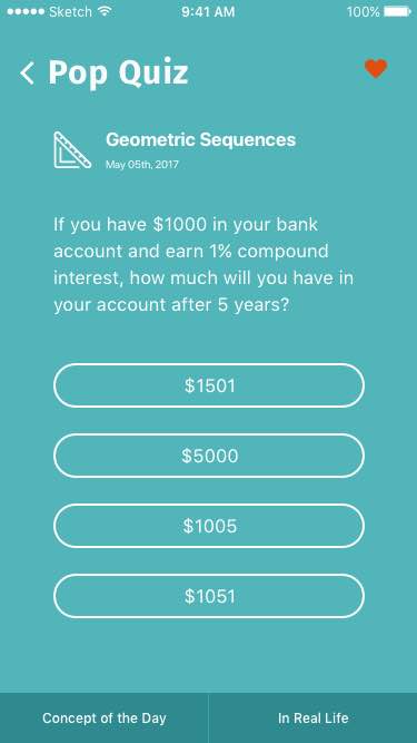
According to the wireframes, NOTED has 3 major features: Calendar, Thoughts and Daily-pop. “Calendar” allows users to check their schedule and add thoughts to a certain event (like an upcoming exam). Users can view their thoughts by date or by subject in “Thoughts” section. “Daily-pop” provides users pieces of knowledge and small quizzes. Users can review these pops by date or subject.
Homepage
Calendar
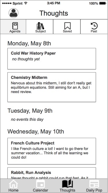
Thoughts
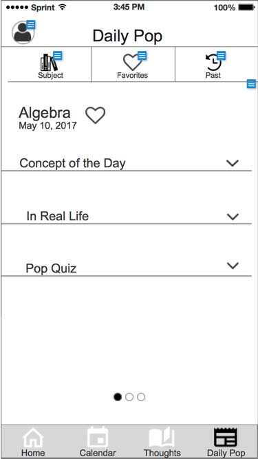
Daily-pop
The UX project was based on two user personas: the multi-tasking mom and the passionate teen. We started by trying to balance both parties’ needs. But we soon realized that even though both parents and children use this app, it was the children who write their thoughts down, which made the students our priority users. Realizing that, we adjusted our focus. Throughout this project, we tried to answer this question:
How can we design an app that makes students feel comfortable to share their thoughts with parents?
We looked at some education apps including PowerSchool, PupilPath and KickBoard.
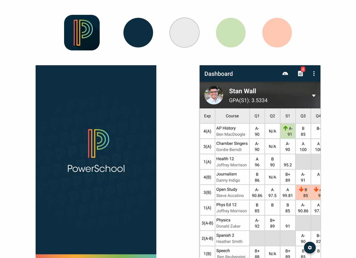
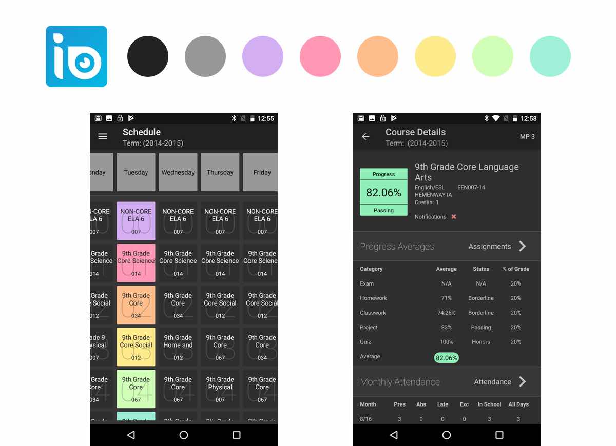
Powerschool successfully utilized the space and created a relatively clean interface. But we thought the layout of the grade page was too packed. KickBoard had a soft and welcoming color palette. But the condensed font made it hard to read. PupilPath used an interesting sticky note idea to imitate physical schedules. But we agreed the dark background affected readability.
I wanted to design a clean interface that made students and parents feel comfortable and fun to use:
With these goals in mind, we came up with these principles to as our research and design guidance:

NOTED facilitate communication between parents and students by using colors and imagery that don’t make the students uncomfortable sharing their thoughts.
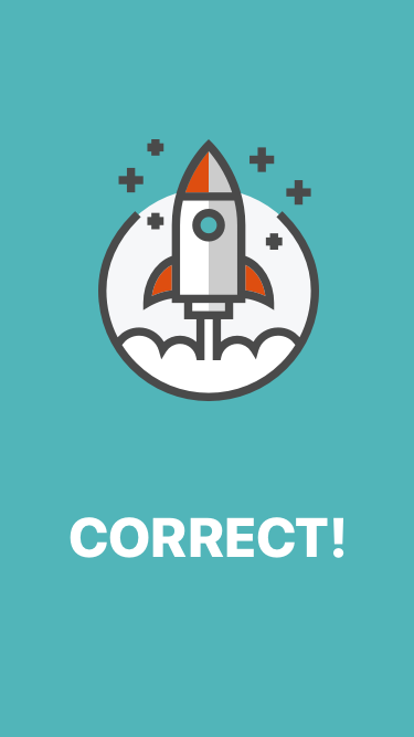
Gamification of tasks encourages reuse, specifically applauding the student because they are the ones who generate the content.

Present a large quantity of useful data but in an easily digestible way so that the users can stay informed and organized.
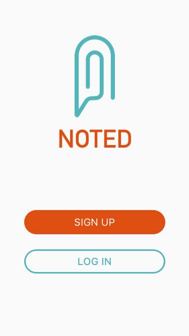
We were tasked to rename and design the branding for this app. After several rounds of word mapping, I realized the key feature of the app was similar to a note on the fridge. It facilitates family communication. I kept digging in that concept and after several rounds of iteration, I arrived at a logo with multiple meanings and minimal style, which worked well on different-size screens.
Logo sketches
Final logo
Along with the logo design process, I explored 3 style directions under the guidance of our research and design principles.
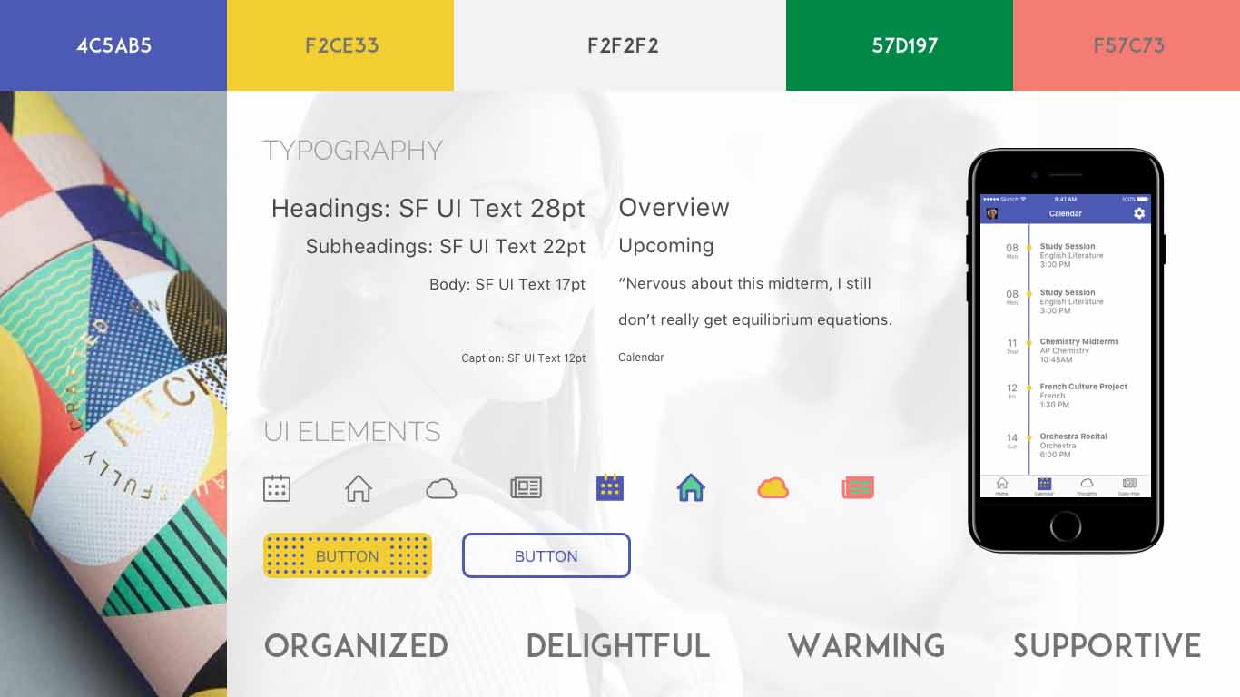
Color label approach: Inspired by color label system, this direction used different color combination for different tabs. Users liked the idea but thought the pine green and salmon color looked a little off. The button decoration didn’t serve a purpose and affected readability.
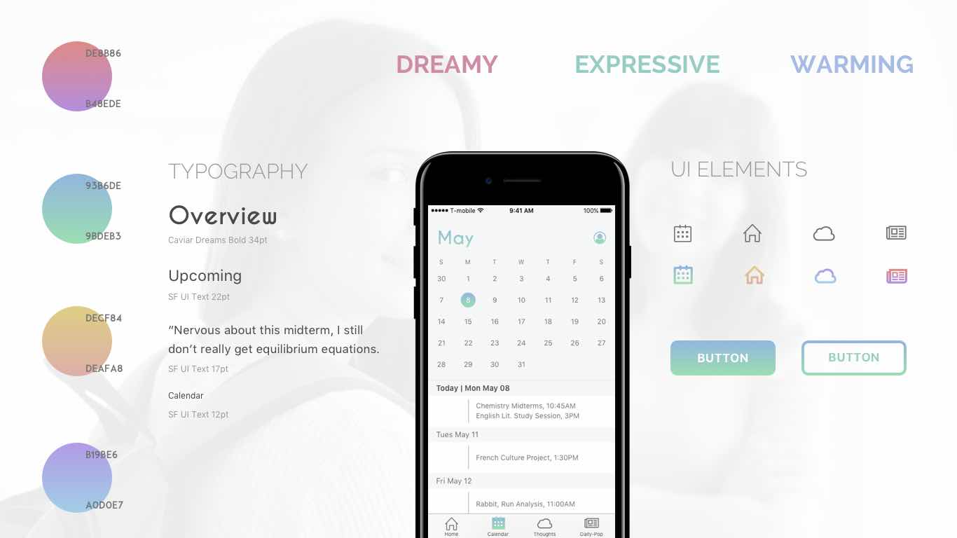
Dreamy approach: This style used gradient colors and thick line icons to create a dreamy look. During the testing, users thought it was appropriate for high school students, but might be too trendy for parents. They also thought the pink gradient tab was a little feminine.
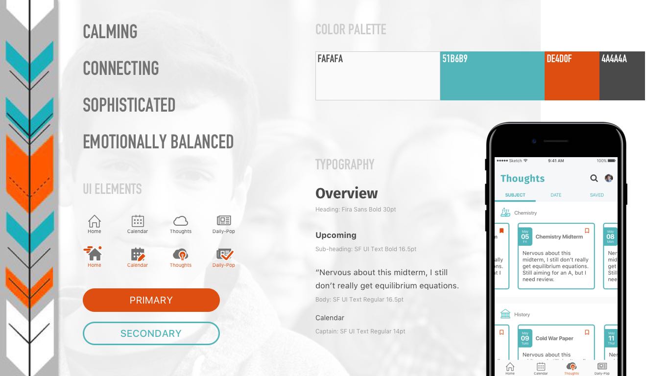
Calming approach: The teal and orange color kept a good balance of sophistication and fun. The combination of line icons and filled icons differentiated the active state in a fun way. User testing showed this aligned with the brand the most but the icon colors needed to be cleaned up.
Keeping the feedback in mind, I went with the third direction with simplified icon colors and buttons with a softer edge.
After reviewing the UX wireframes, our team found some things that could be improved.
Based on the improved wireframes, I built two sets of screens: the student version and the parent version. After several rounds of peer feedback and iterations, I arrived at my final screens:
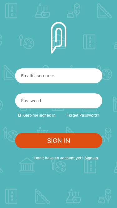
The on boarding flow welcomes users with a calming yet fun look and feel.
The on boarding flow welcomes users with a calming yet fun look and feel.
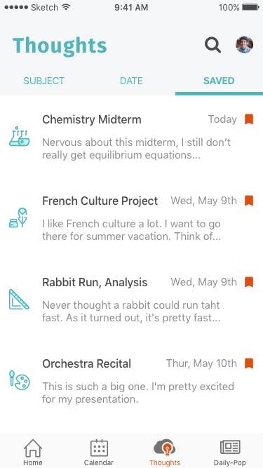
Previously, these elements were all stored in folders, meaning they needed a four-step process to view certain thoughts. My wireframes used a list and carousel combination, which simplified the process to three steps.
The illustration and animation in the splash page reflects the gamification design principle.
To further develop NOTED’s brand, I designed a responsive marketing website, a UI kit and a style guide. I realized even though students were the ones that used the app, it was probably their parents who shopped for the app in the first place. This meant the priority target audience for the marketing site is parents.
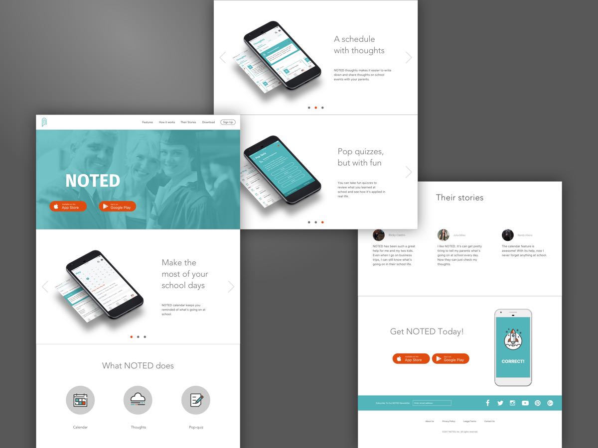
Responsive marketing website
Working on a project without stakeholders was quite a challenge for me. Here are things I would like to improve if given more time.
We thought the list view + carousel view was a good solution for viewing more information with less scrolling down. However, one guest critic at our final presentation mentioned that the scrolling feature might act weirdly with both list and carousel. If given more time, I would like to A/B test the current solution and a simpler list view.
Due to the time limitation, the parent version now was a simplified student version with editing feature removed and swapping children feature added. I would love to do more research on parents’ needs and how to solve their problems in the product.
Although NOTED was a UI project, my teammates and I spent a lot of time analyzing and discuss the wireframes. Through the whole process, I learned that functionality is the foundation for aesthetics. As a UI designer, my job is not only to make things look pretty, I should always prioritize the functionality and user needs.
I also learned the value of always consulting others, especially those with more experience. One of our guest critics, an experienced UX designer, pointed out my list+carousel view wouldn’t perform accurately in real products, which was something I never thought about before being told.